I have always been interested in the complex alphanumeric displays that are commonly found on older electronic devices, and I have been wanting to take it a step further, and create an in-between ground from the 14/16 segment displays and the dot matrix display.
![]()
![]()
![]()
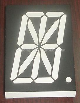
I have designed three alphanumeric displays that will slot between the 16 and the dot. Since the 14/16 are usually referred to as "starburst" displays, I have called mine "Nova, Supernova, and Hypernova respectively."
Nova: Has three diagonals in each corner. It has twenty-three segments in all.
Supernova: Has five diagonals in each corner. It has thirty-three segments in all.
Hypernova: Has seven diagonals in each corner. It has forty-one segments in all. Forty-five with the side segments cut.
All three have a central dot.
More segments make more characters possible, and especially more characters utilizing the lower half of the display.
I have tried several times to submit these fonts to MyFonts but they won't take it even though they have several fonts of the same genre (7's and 14's). The font board has told me my font is illegible and has spacing issues. How do I fix my font to make it look professional and get accepted?
The fonts are available for download on Font Space and 1001 Fonts.
![]()
http://www.fontspace.com/nihar-mazumdar
http://1930.1001fonts.com


I have designed three alphanumeric displays that will slot between the 16 and the dot. Since the 14/16 are usually referred to as "starburst" displays, I have called mine "Nova, Supernova, and Hypernova respectively."
Nova: Has three diagonals in each corner. It has twenty-three segments in all.
Supernova: Has five diagonals in each corner. It has thirty-three segments in all.
Hypernova: Has seven diagonals in each corner. It has forty-one segments in all. Forty-five with the side segments cut.
All three have a central dot.
More segments make more characters possible, and especially more characters utilizing the lower half of the display.
I have tried several times to submit these fonts to MyFonts but they won't take it even though they have several fonts of the same genre (7's and 14's). The font board has told me my font is illegible and has spacing issues. How do I fix my font to make it look professional and get accepted?
The fonts are available for download on Font Space and 1001 Fonts.

http://www.fontspace.com/nihar-mazumdar
http://1930.1001fonts.com