Around two years ago I released Abraham, a hand-drawn typeface with varying lettershapes (3 alternates for all uppercase and lowercase letters, 'randomly' used so the words look like they are hand-drawn, a lot of calt and salt).
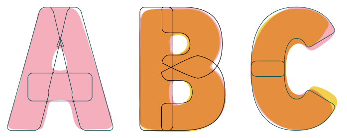
I decided to try and 'retro-engeneer' the solid/straight typeface that Abraham is supposedly drawn from, as if the shapes used in Abraham were the sketches for a more straight lined typeface. Working title: Bram.
Here's what I have so far (see attached sample): if you flip the pages in that PDF, you'll first see two pages where uppercase letters of Abraham are featured, the 3rd page are the letters I arrived at.
![Image: http://cd8ba0b44a15c10065fd-24461f391e20b7336331d5789078af53.r23.cf1.rackcdn.com/typeboard.vanillaforums.com/editor/4x/xu0p0sosnfs8.png]()
Here and there I had to smuggle a little bit, but this is getting pretty close. The squared /period and /comma didn't feel right for some reason, so I treated those as circles of similar shape as the insides of /six /eight /nine.
Since Abraham was thick and solid, but also smooth and rounded at the edges, I treated all corners in the same manner. This probably wouldn't help much when you'd use this in print in small sizes, but I feel it would work nice when used in (very) large sizes. As Abraham was intended too. See some samples below:
![Image: http://cd8ba0b44a15c10065fd-24461f391e20b7336331d5789078af53.r23.cf1.rackcdn.com/typeboard.vanillaforums.com/editor/sq/yzji1bdhnkot.png]()
![Image: http://cd8ba0b44a15c10065fd-24461f391e20b7336331d5789078af53.r23.cf1.rackcdn.com/typeboard.vanillaforums.com/editor/18/bncgelv3202f.png]()
![Image: http://cd8ba0b44a15c10065fd-24461f391e20b7336331d5789078af53.r23.cf1.rackcdn.com/typeboard.vanillaforums.com/editor/65/czubumb7qz4e.png]()
What do you think so far. Any oddities that catch your attention, that need fixing? I don't want to depart too much from the 'original' Abraham, but some improvement here and there might be nice.
Thanks for watching!
I decided to try and 'retro-engeneer' the solid/straight typeface that Abraham is supposedly drawn from, as if the shapes used in Abraham were the sketches for a more straight lined typeface. Working title: Bram.
Here's what I have so far (see attached sample): if you flip the pages in that PDF, you'll first see two pages where uppercase letters of Abraham are featured, the 3rd page are the letters I arrived at.

Here and there I had to smuggle a little bit, but this is getting pretty close. The squared /period and /comma didn't feel right for some reason, so I treated those as circles of similar shape as the insides of /six /eight /nine.
Since Abraham was thick and solid, but also smooth and rounded at the edges, I treated all corners in the same manner. This probably wouldn't help much when you'd use this in print in small sizes, but I feel it would work nice when used in (very) large sizes. As Abraham was intended too. See some samples below:


What do you think so far. Any oddities that catch your attention, that need fixing? I don't want to depart too much from the 'original' Abraham, but some improvement here and there might be nice.
Thanks for watching!