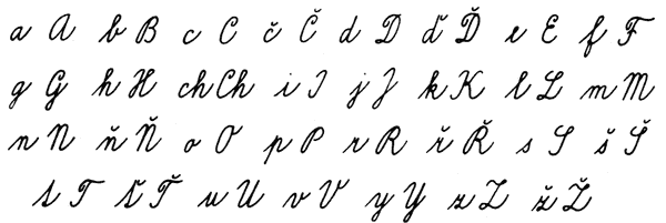
Wikipedia states switching the caron to the wedge [apostrophe] shape for /d, /l, /L, /t is optional in handwriting. And indeed, I was able to find a sample of calligraphy that featured those letters with a regular hacek:

Moreover, this is probably what's taught in schools:

What do you think of it? I didn't find a script font that would feature such extravagancy. My suspicion is that by now the readers of Slovak and Czech are so used to seeing the wedge hacek in print, that including those full carons in a font could be mistaken for lack of knowledge instead of purposeful action (a bug, not a feature).
I also wonder if, thanks to print and computers, the wedge-shaped hacek is more often employed in handwriting then not? I stumbled upon an article about a new simplified script for teaching in Czechia that has been tested in a few select schools, as well as a discussion about this. Since this ‘new’ script is a typeface and was developed by a type designer, of course it features the wedge-shaped carons.
What bugs me is why ‘L’ and ‘t’ were also blessed with the mini-caron. I get that ‘d’ and ‘l’ as letters with ascenders will often be taller than capitals and as such are worse at accommodating regular accents. But the idea that “‘t’ is a tall letter” is a misconception that has been paining me since day 1. And ‘L’ is just as bad as the other capitals, except for maybe the fact
that it has only the stem at the top and there would be a huge fight
like the one about placing circumflex over ‘h’ for Esperanto etc. So perhaps the thing with ‘t’ and ‘L’ is more about horizontal metrics?
Meanwhile /dcaron and /lcaron are liabilities because you have to kern them. Since we live in the age of line spacing defaulting to 120% or so in most software, wouldn't it all be easier if we switched back to regular carons for all?
Back to the main question, what do you think of the following?

To state the obvious: I figured /L would go better with a full caron since there's more going on at the top than in a print ‘L’. Other than that, the other letters look good with the semi-caron, but I just wanted to see what happens, test the waters, and maybe use this solution in another project, where it could actually solve a problem (this would be more useful with a bolder weight, where the semi-carons create spacing issues).
The main problem I see here, besides maybe disturbing the reader, is that the carons are more on top (in /d even more on the left) than on the right of the letter, which seems to be desired whatever the form of the accent itself. But then again, I sense that the rightward positioning of hacek in handwriting may have been influenced by print... I'm a bit confused.