Hello,
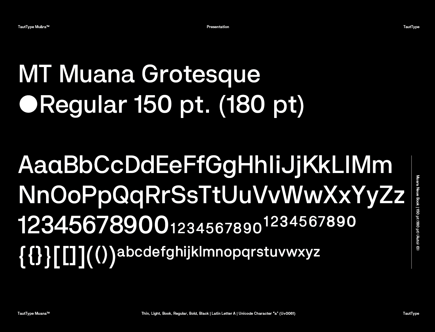
I am really young guy, really want to be type designer future. I am just design some monospace and little exprimental grotesque before. The world don't need an another grotesque I know but this is what I want for me. I design all things from beginning, not change another typeface, I just look different grotesque to see what solutions they use for letter, like Helvetica Neue. I design on Fontlab, I use the masters for different weight, create another weight and make them bold height change. I am not sure this is correct way to create weight.
Try to design good for eye, little different solutions for WMN letters. Bold and black weight have more inktraps in small letter, also I am not sure is it called ink traps. Really want to hear your opinion, I am ask everyone because I want to change the typeface more stable for selling I hope.
I am realizing now, the metrics and kerning are not designed. I am sorry but I am gonna ask either if this works for reivewing.
I want to hear your advice also about type design. Thank you.
![Image: https://us.v-cdn.net/5019405/uploads/editor/jp/sxw1ygkeuy08.png]()
![]()
![]()
![]()
![Image: https://us.v-cdn.net/5019405/uploads/editor/em/uixhz71d9mct.png]()
I am really young guy, really want to be type designer future. I am just design some monospace and little exprimental grotesque before. The world don't need an another grotesque I know but this is what I want for me. I design all things from beginning, not change another typeface, I just look different grotesque to see what solutions they use for letter, like Helvetica Neue. I design on Fontlab, I use the masters for different weight, create another weight and make them bold height change. I am not sure this is correct way to create weight.
Try to design good for eye, little different solutions for WMN letters. Bold and black weight have more inktraps in small letter, also I am not sure is it called ink traps. Really want to hear your opinion, I am ask everyone because I want to change the typeface more stable for selling I hope.
I am realizing now, the metrics and kerning are not designed. I am sorry but I am gonna ask either if this works for reivewing.
I want to hear your advice also about type design. Thank you.


