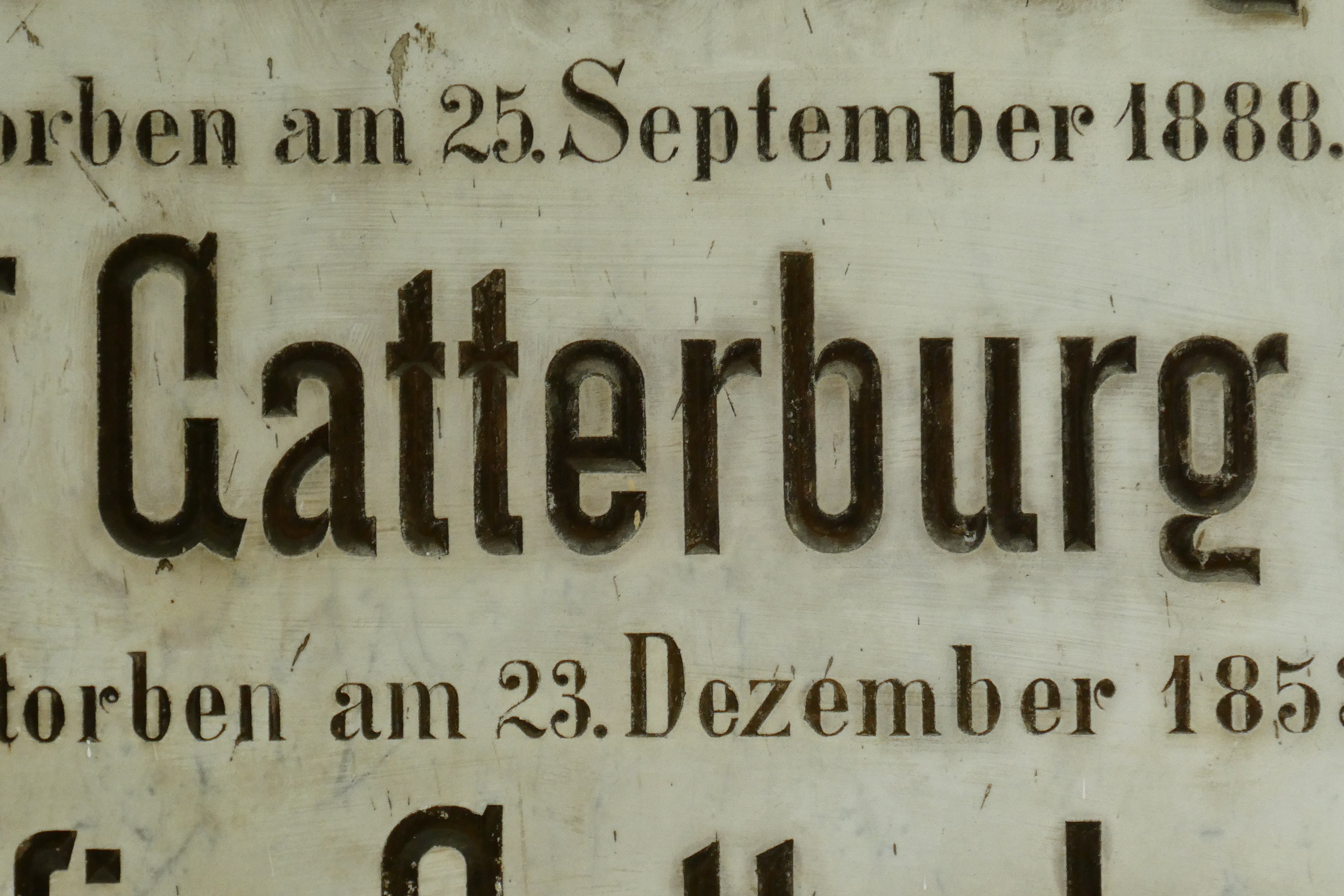
Some of you may have seen this on Twitter recently: "Something old but surprisingly modern in development".
I have been developing it further; making the Thin weight more condensed to fit with the style of the inscription, and a couple of extra weights, a Regular and Bold. There was some comments about the style of the G and g, so I produced an alternate style for those, (original style on the left, 2nd image), but having lived with it for a while now I am quite used to the original style and I think it fits perfectly.
Any comments regarding style, proportions etc?


