As I posted on Typophile, this Monday I had a sudden impulse to doodle an exaggerated light, contrasted, space-taking Garalde with impossibly tiny counters, long extenders and no respect for long amounts of text or small sizes.
![image]() I've started implementing it in Glyphs, and I'm having way too much fun doing it.
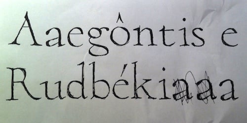
I've started implementing it in Glyphs, and I'm having way too much fun doing it.
![image]() I'm toying with the name "Paramond", hinting to its Garalde genome and its delusions of grandeur. Where other fonts may be touted as workhorses, this one would be the unicorn.
I'm not using any one form of Garamond, whether historical or recent, as a reference. I drew most characters from scratch, based on my mental image of what garaldes look like, and tweaked them until I liked them. When I run into trouble (for instance, that /f was a tough cookie, and I'm still not too satisfied with it), I open a page of garaldes on MyFonts and skim over them to get a general impression of the existing solutions without getting too attached to a single one.
What do you think so far?
I'm toying with the name "Paramond", hinting to its Garalde genome and its delusions of grandeur. Where other fonts may be touted as workhorses, this one would be the unicorn.
I'm not using any one form of Garamond, whether historical or recent, as a reference. I drew most characters from scratch, based on my mental image of what garaldes look like, and tweaked them until I liked them. When I run into trouble (for instance, that /f was a tough cookie, and I'm still not too satisfied with it), I open a page of garaldes on MyFonts and skim over them to get a general impression of the existing solutions without getting too attached to a single one.
What do you think so far?
 I've started implementing it in Glyphs, and I'm having way too much fun doing it.
 I'm toying with the name "Paramond", hinting to its Garalde genome and its delusions of grandeur. Where other fonts may be touted as workhorses, this one would be the unicorn.
I'm not using any one form of Garamond, whether historical or recent, as a reference. I drew most characters from scratch, based on my mental image of what garaldes look like, and tweaked them until I liked them. When I run into trouble (for instance, that /f was a tough cookie, and I'm still not too satisfied with it), I open a page of garaldes on MyFonts and skim over them to get a general impression of the existing solutions without getting too attached to a single one.
What do you think so far?
I'm toying with the name "Paramond", hinting to its Garalde genome and its delusions of grandeur. Where other fonts may be touted as workhorses, this one would be the unicorn.
I'm not using any one form of Garamond, whether historical or recent, as a reference. I drew most characters from scratch, based on my mental image of what garaldes look like, and tweaked them until I liked them. When I run into trouble (for instance, that /f was a tough cookie, and I'm still not too satisfied with it), I open a page of garaldes on MyFonts and skim over them to get a general impression of the existing solutions without getting too attached to a single one.
What do you think so far?