Haha made you look :P
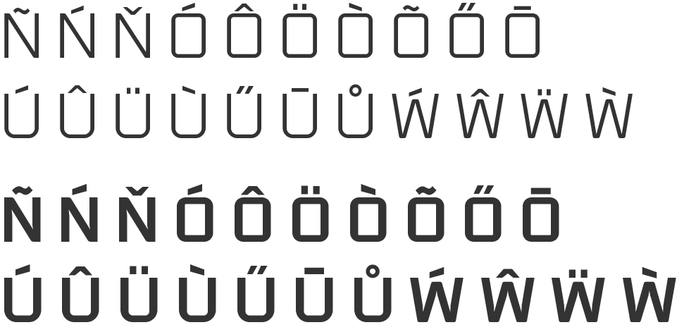
Worked on diacritics over the last few days trying to get an even balance. I found positioning of the mark so it's close enough to appear as one with its letter, but separate enough not to get clogged at small sizes quite challenging.
Some of the better resources I used:
'How not to draw accents' by David Jonathon Ross https://www.youtube.com/watch?v=-N--5Wg-2p4
'On Diacritics' by David Březina https://ilovetypography.com/2009/01/24/on-diacritics/
Pangrams in various languages http://clagnut.com/blog/2380/
And http://diacritics.typo.cz
![]()
For the capitals I'm foregoing consistent vertical positioning, shifting the mark up or down on a letter by letter basis. I have to do some proper proofing to see if this actually works or not.
![Image: https://us.v-cdn.net/5019405/uploads/editor/bq/n5fbzzzjkjry.png]()
All comments welcome![:) :)]()
Worked on diacritics over the last few days trying to get an even balance. I found positioning of the mark so it's close enough to appear as one with its letter, but separate enough not to get clogged at small sizes quite challenging.
Some of the better resources I used:
'How not to draw accents' by David Jonathon Ross https://www.youtube.com/watch?v=-N--5Wg-2p4
'On Diacritics' by David Březina https://ilovetypography.com/2009/01/24/on-diacritics/
Pangrams in various languages http://clagnut.com/blog/2380/
And http://diacritics.typo.cz

For the capitals I'm foregoing consistent vertical positioning, shifting the mark up or down on a letter by letter basis. I have to do some proper proofing to see if this actually works or not.

All comments welcome
