Hello.
This is a small text typeface based (loosely) on Granjon’s Ascendonica. (As seen here: https://search.museumplantinmoretus.be/Details/collect/206965)
(I am not sure about the name yet.)
My aim is not to make a revival. I would like to make a garalde (kind of sad Granjon is not in there… Gargranjalde?) typeface fit for long text in small (6 pt?) sizes in Latin, Cyrillic, and Greek.
So — legibility is priority.

Any comments, critiques, or suggestions are welcome.
LATIN
You will notice some clear divergences from Granjon’s type in the /a and /g, as well as, albeit less drastic, in the /e, /K, /k, /Q and /Z, /z.
CYRILLIC
How would one space the cyrillic? Is there a good rule for the proportions on the letters in relation to each other? Currently, I have made п /pe-cy the same width as the /n, but with slightly increased (and symmetrical) side bearings. /n
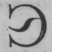
Some exterior opinions on the design of some Cyrillic letterforms would be welcome (though not necessarily agreed with). In particular, the д /de-cy, к /ka-cy (and ж /zhe-cy), л /el-cy, ц /tse-cy (and щ /shcha-cy), and э /ereversed-cy
Cyrillic Petrine Reform: https://www.wdl.org/en/item/561/view/1/3/
д: I don’t like the square form (see л). Now, we have two triangles to choose from: leaning triangle, and normal triangle.

к and ж: I am not convinced they should copy the latin /k. I will probably add latin-style as stylistic alternates. But I can’t help to wonder why the Petrine reform к and ж could have just been copied from the latin — but no.

л: I don’t like the square form. I understand it is better for the colour of the text, but I don’t think it is sufficiently legible (or beautiful). Now, ball terminal, or not? Both make sense to me.

ц and щ: Swooshy tail? It’s pretty. But it might be too distracting for nothing. It is not important to differentiate ш and щ to understand a word.

э: Swooshy… nose?
Also, should the capitals resemble the lowercase?
GREEK
Lowercase not done yet.
I found these wonderful little capitals by aldus (I think).

Is this shape of /Xi acceptable (legible) nowadays?

I wanted to make an aldine /Psi, but I could not find an example that didn’t require an exorbitant amount of imagination to draw from. So the current one is based on Garamont’s Parangonne Capitales Grecques.

Sorry for the avalanche.
Here is a pdf sample of the typeface.
Please ignore the invisible hyphen :-)