Quantcast
Channel: TypeDrawers
Viewing all 4153 articles
Browse latest View live

Simple script: Find and complete real ascender and descender values in all open fonts

$
0
0
Hi there,

This script will find the highest and lowest Y values in all open fonts (typically a family) and use them to fill the OpenType specific font metrics values. Works in Fontlab + Robofab (and probably Robofont too).


#FLM: ReType Complete Real Asc/Desc V2.0
# Find and fill real asc and desc values in all open fonts 
from robofab.world import CurrentFont,AllFonts


max_Y_values = []
min_Y_values = []


for font in AllFonts():
	for x in font:
			max_Y_values.append(x.box[3])
			min_Y_values.append(x.box[1])

WinAscend = max(max_Y_values)
WinDescend = min(min_Y_values)
Ascender =	font.info.ascender 
Descender =	font.info.descender
Gap =  (Ascender + abs(Descender)) - (WinAscend + abs(WinDescend)) 

for font in AllFonts():
	font.info.openTypeOS2WinAscent = WinAscend
	font.info.openTypeOS2WinDescent = abs(WinDescend)
	font.info.openTypeOS2TypoAscender = Ascender
	font.info.openTypeOS2TypoDescender = Descender
	font.info.openTypeHheaAscender = WinAscend
	font.info.openTypeHheaDescender = -abs(WinDescend)
	font.info.openTypeHheaLineGap = 0
	font.info.openTypeOS2TypoLineGap = abs(Gap)

print
print "In all open fonts:"
print "The maximun Y value is: "+ str(max(max_Y_values))
print "The minimum Y value is: "+ str(min(min_Y_values))
print "TypoLineGap is: " + str(Gap) 

Aksharaya calligraphy manuals

$
0
0
In the "shut up and take my money" department, Aksharaya have prepared six calligraphy manuals for the upcoming Typoday 2016 conference in Bangalore - introductory manuals for Devanagari, Nastaliq Urdu, Gujarati, Gumurkhi, Odia and Kannada.


If you email info@aksharaya.org, they'll courier copies to you after the conference.

Rest in Peace dear Karl Gerstner

Inverste Slant / Italic font modification

$
0
0
Hi,

I am not a font designer. I hope I post my question in the right category.


I have researched inverste slanted / italic fonts on the internet with unfortunately little success

I am writing a lot of technical documents which I then safe as PDF file. Due to financial and legal limitations I try to use only open source or any other license free fonts. I try also to reduce the use of Windows supplied fonts or fonts that one can download from various web pages as "free font" as well.

I have been trying to find a simple to use tool or script that allows me to convert a font file (ttf, otf) into reverse italic o reverse slant. As an example see the below font set which also contains a Rev font.


For example I would like to use the Fira font and add also a reverse italic / slant ttf or otf versions of the font to my Windows system so that any application can use that font.

The reason is that I want to standardise my documents to use as little fonts as possible.

I was unable to find anything that would allow me to complete the task and not become a burden to anybody who can do this for me for free.

I know of Font Forge but do not have the necessary skills to use it.

Many thanks for your kind help and assistance.

Greetings,

Christian

FontArk

$
0
0
Hi

Did anyone here try Fontark?

I'm involved in the development of it and would like to hear (and share) some opinions, it is still in early stage but already capable of some wonders.
We represent a unique glyphs synchronisation system (The SmartX system), which is most versatile and aimed to replace the "scissors&paper" like actions of slice-cut-paste-merge shapes with real-time multiple character editing.
It's mostly demonstrated with Skeleton usage, but works cool also with strict outline drawing. It's principles and operation are most simple and very powerful, yet challenging to explain in an elevator .

I'd love to demonstrate it in action if anyone's interested, and answer any question.

Berthold bullies competing font producers – report here when you’re hit by them

$
0
0
On request by Berthold Direct Corp. (Chicago) Myfonts has excluded my font Popelka from sales on Dec. 30, 2016. Berhold’s claim is, according to J. Collins of MyFonts, “that the name sounds confusingly similar to Berthold's trademark for Poppl”. I regard this action being unjust and harassing and I have informed MyFonts that I demand my font being put back alive to sales.
As it turns out, Berthold seems to have conducted more such affairs over the past years against other parties. If you’re a type designer or company having faced such intimidating behaviour, please report your story here and now. It is important to stop this kind of agression in the type industry. We need to ally and join forces to make this known to a wider design affine public audience.
If you’re a blogger or news person, feel free to pick up this story and spread the word.

Windows 10 Font Rendering Blues (and Reds and Greens)

$
0
0

Just upgraded to a new system, and while I’m mostly enjoying Win 10, its font rendering is horridiculous on my TV monitor. Stems that are most definitely the same width generally aren’t, even between different instantiations! A word like “running” has three different glyph renderings of /n, and none of them match the /u or the /i. Antialiasing only improves things from “inexhaustably execrable” to merely “really crappy.” What gives?

I’ve been through different resolutions (even hacking different resolutions into the video driver), tried the Win 8 DPI scaling fix, tried almost every one of the (5×3×5×5… 375‽) ClearType tuner combinations, tried both scaling options, tried GDI++ and even tried MacType. None of these actually work on my system, and they all suck, but MacType is the least objectionable by far (but it's still kinda like the difference between Trump and Dubya).


Interestingly enough, the screen grab isn’t as bad as the live screen; there’s probably a layer that warps it for the actual viewing. A few glyphs, such as /T and /e, are reasonably similar, but the overall inconsistencies are driving me crazy. (Not that it's a long trip for any type geek, but you know what I mean). PS-flavored outlines fare a bit better than TT, fwiw.

Heh, maybe Microsoft just wanted to incorporate true randomness into OpenType. Every font becomes Beowolf!

An aerographic detail

$
0
0
I don’t know if anyone noticed it earlier, I did only recently. Those bits – serifs? aerifs?? – change their position dependent on the air flow direction.
Funny idea, actually.


Merchant of Alphabets

$
0
0
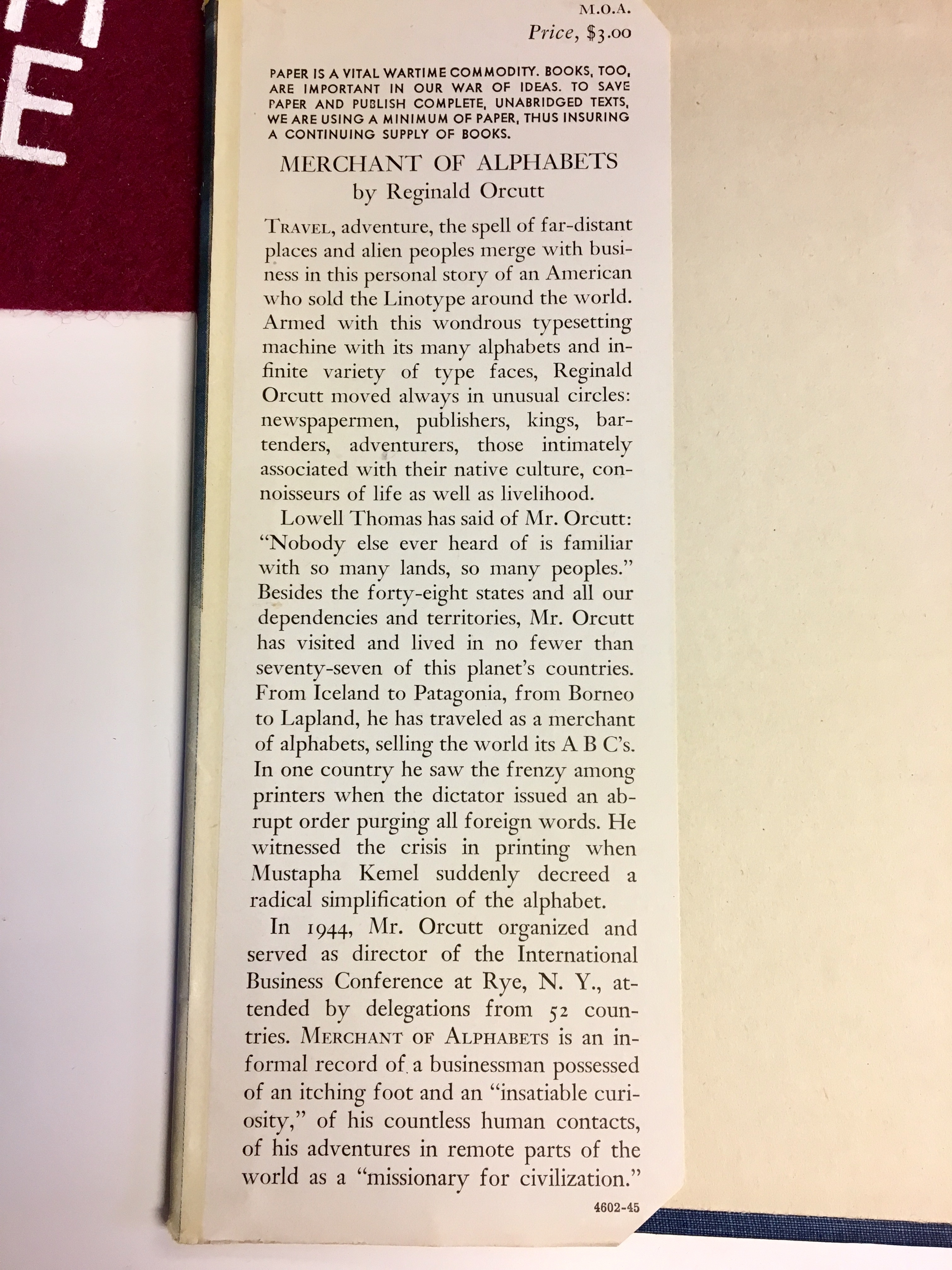
A few years ago (due to my research for "Linotype: The Film) I came across the book "Merchant of Alphabets" by Reginald Orcutt. It is a fascinating book published in 1945 about Orcutt's work and travels selling Linotypes around the world.

As you can read in the attached image, he visited at least 77 countries in the first half of the 20th century and tells great stories of travel, adventure, and includes a bit of typographic history. I am personally fascinated by his description of travel in the days of steamships, clippers, and telegrams.

The book is an auto-biography written in the charming, old-timey style of a travelogue. Orcutt comes across as an ambassador of Mergenthaler Linotype in the classiest of sense of the term.

Anyway, I'm considering trying to publish the whole book online, just for fun and to share with others.

A few questions:

1 - Is anyone interested in this subject or book?

2 - Would you read a chapter per week as some sort of series of posts?

3 - Where should I publish something like this? Medium? Personal blog (which I don't have)?

4 - Any idea of issues with copyright? The book was published in 1945 by Doubleday, Doran and Company (which has now merged with Knopf). It is not on Google Books as far as I can tell.

Please be honest either way -- I'm not going to get offended if no one is interested. Maybe it is dumb idea, who knows?

OpenType SVG color fonts coming to Windows 10 :)

$
0
0


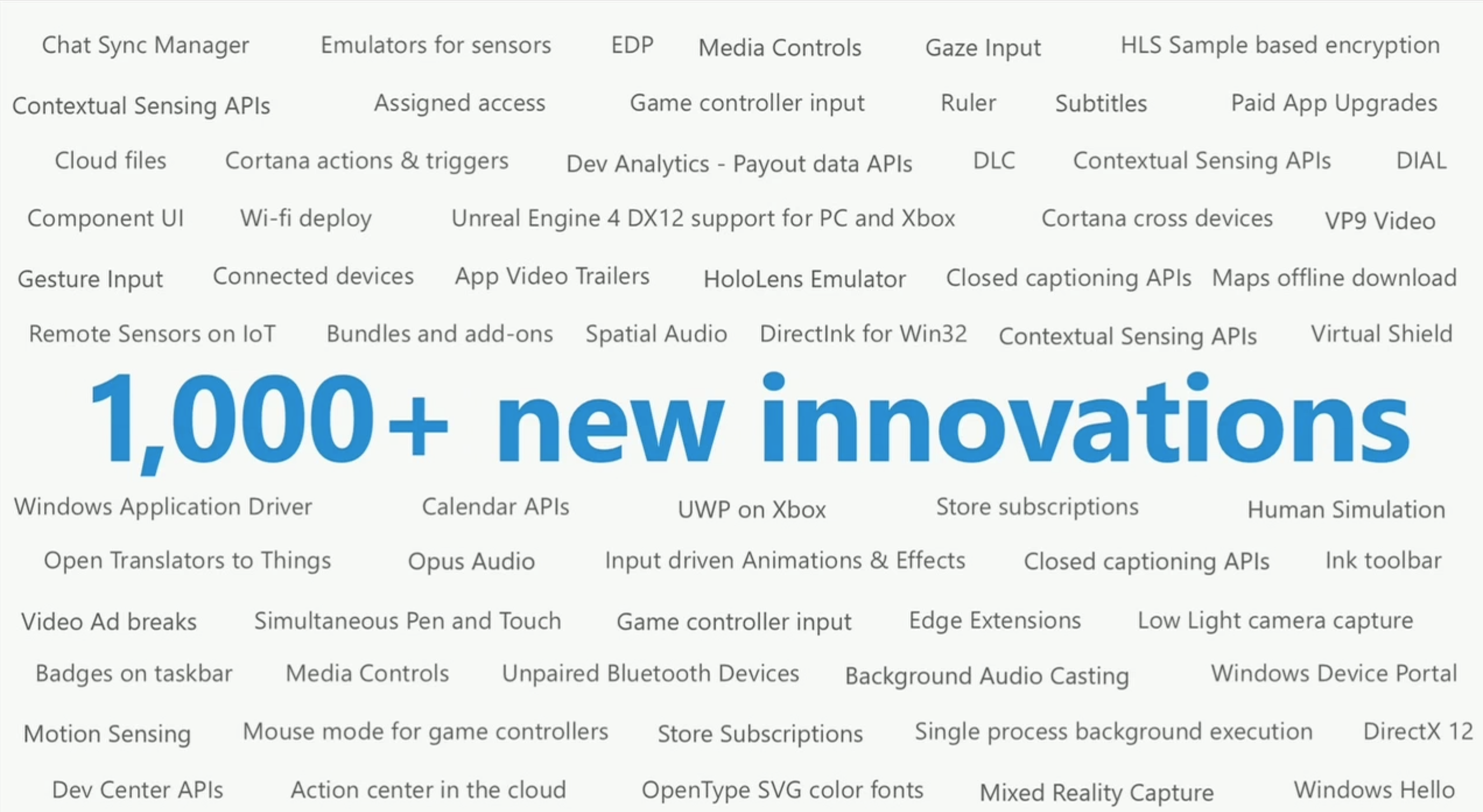
During the keynote talk at the Microsoft Build conference, at 2:22:51 Kevin Gallo showed a slide outlining the new developer-related features of the Windows 10 Anniversary Update that will ship in the summer. One item stuck out to me as a nice surprise: “OpenType SVG color fonts”: 
https://www.facebook.com/photo.php?fbid=10154033931238764

We’ve come a long way since I proposed the marriage of SVG and OpenType as a way to get multi-color and typographically sophisticated fonts. I posted this on several discussion lists back in June 2011: 

My proposal was met with some reluctance on one hand, but keen interest on the other. In October 2011, Sairus Patel from Adobe presented the first draft of a specification detailing how SVG glyph descriptions could be placed inside OpenType fonts. We have formed a working group within the W3C consortium: https://www.w3.org/community/svgopentype/ and two years later, the group has presented a final specification. In March 2015, the OpenType font format specification was updated to version 1.7 and added the support for SVG glyph descriptions: 

Mozilla Firefox was the first app that actually implemented OpenType SVG color fonts, and FontLab quickly followed with the free FontLab Pad app: http://www.fontlab.com/fontlab-pad/ 

Yet the future of OpenType SVG was still unsure. OpenType SVG color fonts can be created with FontLab VI ( http://www.fontlab.com/font-editor/fontlab-vi/ ) and TransType 4 ( http://www.fontlab.com/font-converter/transtype/ ), but there are still some glitches we need to iron out. But now, we know that it actually is worth the effort — because OpenType SVG color fonts are coming to Windows! 

Many thanks to all my colleagues at FontLab, Adobe, Microsoft, Mozilla, Monotype, the W3 Consortium and other groups and companies who’ve worked over the last five years to turn my simple modest idea into reality! :) 

Best,
Adam

Ps. The Microsoft Build conference keynote can be watched at: 

Anfíbia - new display font

$
0
0

Hello! It is the second time I come post my job here for analysis, this latter is also derived from the design shown here. In this new typeface left the art nouveau influences more explicit in Cap, approaching more of the ECCENTRIC, and re-moved the noise present in that earlier work. The result though this has not already fully-finished (lack basic ligatures ff, fi ... and special Latin characters), this pleases me greatly, however as I am new to publishing projects come here I asked you to say truthfully what They think of my typography.

It's called ANFÍBIA (amphibious) for now, to be a display font that in their low-cases shows be very efficient as text typeface, a source that integrate well in two different environments without losing their identity, in my view, of course.

Sorry my English is very limited.

Dedicate library for identifying strokes/stems?

$
0
0
Sometimes I am wondering that there would be a library for stroke/stem identification. Input an outline and output the identified strokes/stems with point index correspondence.
Should I extract them from autohinters?

Opentype case & eszett

$
0
0
I tried to specify two special substitutions in my case feature:

ß > ẞ
ĸ > K‘

In Adobe’s enviroment ß becomes SS and ĸ remains ĸ, but OpenType-savvy browsers respect my feature. I understand there is some discussion re. the cap eszett, and I am not sure about the one-to-many substitution in regards to the old greenlandic k. Would it be better to leave these out alltogether? Are there other “hard-coded” case variants I should be aware of?

Replace ß by smallcap eszett or smallcap ss?

$
0
0
I would like to get responses from germans especially. An option I'm considering would be to include the smallcap eszett as a discretionary ligature.


What is a newspaper typeface?

$
0
0
Hi there,

I am interested in reading / researching about what is currently understood as a 'newspaper typeface'. In your opinion, what are the (technical and aesthetic) features that make a typeface optimal for newspapers? Can you recommend good books or articles on this subject?
Also, what are the fonts that you think constitute the archetype of a 'newspaper typeface'.
Thanks in advance.

PS, I've found this book to be useful: Historia del periódico y su evolución gráfica, by André Gürtler.


[OTVar] OpenType 1.8.1 released

$
0
0
We've just published a new minor-version update of the OpenType spec: OpenType 1.8.1. This update was primarily aimed at refinements related to OpenType Font Variations, but there were a few non-variations-related technical changes, and we also used it as an opportunity for certain editorial improvements.

The significant technical changes are the following:

- Various technical corrections already noted as OT1.8 errata were incorporated.

- In the 'fvar' table, the countSizePairs field was, in effect, a redundant versioning mechanism. This field has been changed to permanently reserved, and implementations are not expected to use it to determine how to read the table.

- Also regarding the 'fvar' table, expected behaviour was spelled out for the cases of having axisCount = 0 (font is not treated as a variable font) and instanceCount = 0 (there is still one named instance).

- In the MVAR table, the axisCount field in the header was redundant. This field has been changed to permanently reserved.

- Cleanup of the CFF2 and CFF2 CharString chapters included correction of various technical errors, removal of the unused Boolean operand type, and other changes. (These chapters underwent a lot of revision, and I don't have exact details on how many changes might be considered technical changes.)

- An additional field was added to the STAT table, now version 1.1. The 1.0 STAT table (without the additional field) is deprecated.

- Also related to the STAT table, interpretation rules have be added for the case in which format 2 axis value tables for a given axis have overlapping ranges.

- The version 5 OS/2 table added the usLowerOpticalPointSize and usUpperOpticalPointSize fields for families with optical size variants. This mechanism is now superseded by the STAT table. For now, these OS/2 fields are not yet deprecated, but use of the STAT table for this purpose is recommended, and we'd like to deprecate these OS/2 fields in the future.

- In the discussion of the GETVARIATION instruction, "NPUSHB" was corrected to "NPUSHW".

- In OT1.8, we introduced a convention of replacing a single Fixed table version number field with a pair of major/minor version fields. That was applied in OT1.8 only to tables already being touched; in OT1.8.1, this was extended across all tables for which it was possible. (For certain tables, such as 'post', minor numbering with Fixed has been done in a manner that doesn't really allow separating into separate major/minor fields.) In the future, we won't use Fixed for version numbers in any new tables.

- In OT1.8, there were conflicting statements as to whether tables must start at 4-byte-aligned offsets. This is now consistently stated as a requirement.

- Added OpenType Layout language system tags for Eastern Cham and Western Cham.


A couple of things that is mostly editorial / marginally technical have to do with field names and data types. A handful of field names in various tables were changed for better consistency. A much broader change was in data type conventions:

- For fields containing subtable offsets, the data types are now always Offset16 or Offset32.
- The use of Windows data types CHAR, BYTE, SHORT, etc. has now been globally replaced with less ambiguous types: uint8, int8, uint16, int16, uint24, uint32, int32.
- Removed FUNIT and GlyphID as data types. (FUNIT was not actually used anywhere as a data type, and GlyphID had been used only in a limited number of places but not in obvious places such as the 'cmap' and 'glyf' tables.)

If you look at the change log, the majority of changes recorded are these data type changes. In terms of the number of pages touched, this will probably be one of the largest changes in the OpenType spec for a long time.
Paramond — an extreme display serif

$
0
0
As I posted on Typophile, this Monday I had a sudden impulse to doodle an exaggerated light, contrasted, space-taking Garalde with impossibly tiny counters, long extenders and no respect for long amounts of text or small sizes.
image

I've started implementing it in Glyphs, and I'm having way too much fun doing it.
image

I'm toying with the name "Paramond", hinting to its Garalde genome and its delusions of grandeur. Where other fonts may be touted as workhorses, this one would be the unicorn.

I'm not using any one form of Garamond, whether historical or recent, as a reference. I drew most characters from scratch, based on my mental image of what garaldes look like, and tweaked them until I liked them. When I run into trouble (for instance, that /f was a tough cookie, and I'm still not too satisfied with it), I open a page of garaldes on MyFonts and skim over them to get a general impression of the existing solutions without getting too attached to a single one.

What do you think so far?

Webfont vertical metrics strategies

The Mysteries of the Unicode Table

$
0
0
Rather than start a new thread every time I have a question about some obscure glyphs, I figured it'd be better to create a new thread as a catch-all. Feel free to chime in with your own questions.

This isn't about whether or not certain glyphs are valid or worth bothering with. It's about knowing what they're used for some you can make a better judgment call as to whether or not including them. For example, if you're making a text font that might be used in a dictionary, you might want to include IPA characters. If you're making a display font, you might want to leave those out.

Anyway, today, I'm fooling around with Latin Extended Additional and I got to the 1E80-1E85 range.  ẀẁẂẃẄẅ
I've been including these glyphs for about a decade simple because someone emailed me and told me that they're needed for Irish...or was it Welsh. It's been a while; I can't remember.  Anyway, I looked them up today and I can't figure out who, if anyone, actually uses these. Any ideas about these accented W's?

[OTVar] Typos and editorial issues with OT 1.8

$
0
0
Reading the OpenType Font Variations Overview today to get my head around the new shiny, I noticed a number of oddities:

Introduction:

Each axis is defined by a numeric range, using 16.16 floating values.

If you know 16.16 is a data representation format, (called "Fixed" in the rest of the specification) this makes sense. It took me a moment to realise this is what it meant. Are there 16 values in the range?

AFAICS, Fixed numbers are only used as version numbers in the other tables. So maybe this could be clearer. Something like "a numeric range of three values, each represented as 32-bit fixed-point numbers."

 Conceptually, this provides a continuous gradient of variation, a allowing for

Extraneous "a".

So, for instance, if a user or application requires a very-slightly narrower width or slightly more pronounced serifs, fine control over such axes of variation is available.

This sentence should be taken out and shot.

Coordinate Scales and Normalization:

Positions within the variation space can be represent as an n-tuple

Should read "represented"

Variation Data Tables and Miscellaneous Requirements

On certain platoforms, bit 5 affects metrics in vertical layout

Should read "platforms".
Viewing all 4153 articles
Browse latest View live