Quantcast
Channel: TypeDrawers
Viewing all 4153 articles
Browse latest View live

Typography on a (scaled) HiDPI display

$
0
0
Hi,

I have a question regarding how fonts render on a modern HiDPI computer screen.

I'm going to buy a new 15" Windows 10 laptop: the brand new Dell XPS 15 9560 (i7 cpu, 512gb ssd, 16gb ram and gtx 1050 dgpu). My only dilemma is about the display resolution options: FHD (1920x1080) or 4K (3840x2160)?

I read long articles and books on my laptop (pdf, epub and doc files; web pages) and I really, really love to see sharp and crisp typography and images on screen.

With the FHD display, I would set Windows scaling to 100%; with the 4k display to 200%. As a result, I will get the same screen estate with either option.

So my question is: will I see fonts and images more sharp and crisp on the 4k display scaled at 200%, comparing to FHD scaled at 100%? And if this is true, will the difference be really noticeable watching the screen at standard distance?

Mobile App Fonts

$
0
0
What are the correct formats to deliver mobile app fonts to app developers? We’re slowly working on allowing for that, but I can’t seem to find good background information on which platform prefers which font format.

FontFont offers TTF, the new SwissTypefaces site offers OTF files (they could be TTF OTFs though) for mobile app development. If we want to support iOS, Android, and Windows Mobile, what formats should we deliver our fonts in? Hinted? Unhinted?

Any knowledge or links in this direction would be appreciated.

Vietnamese and Pinyin proofing text.

$
0
0
I’m adding Vietnamese and Pinyin to my font proofs. Does anybody have some good, public-domain, text blocks to share?

Custom fonts: pricing of interpolated weights

$
0
0
Hi all,

Those of you doing custom jobs regularly: may I ask how you deal with the pricing of interpolated weights?
Do you charge the same as you do for producing the extreme weights or do you price the in between weights differently?
And if so, does that different pricing of the in between weights also resonate in your exclusivity fee?

Best,
Artur

u+0035 – u+0038

$
0
0
Are the following unicode points used for anything? It seems like they would have been combined with other letters to create ŧ, ł, ø, etc. in a font that doesn’t support these glyphs. Would adding them to a font today serve a purpose?
u+0035 Short Stroke
u+0036 Long Stroke
u+0037 Short Slash
u+0038 Long Slash

And the same for U+0312, Combining turned comma above. Is that just for creating ģ?

TYPO Labs 2017 teaser

$
0
0

Together with its longtime (since 1991!) German partner URW++, the Dutch Type Library has organized a special hands-on session focused on the production and modification of variable fonts at the TYPO Labs 2017 conference on the morning of Friday 7 April. Jürgen Willrodt will demonstrate how to prepare and modify already existing fonts for the production of OpenType Variation fonts , i.e., making all glyphs isomorphic and how to create variable fonts using FoundryMaster (the successor of FontMaster), and finally proofing and modifying OT Variation fonts with OTMaster.


Currently the version of OTMaster that is under development supports OT Variation fonts as follows:

– One can list and view the‘fvar’, ‘STAT’ and ‘gvar’ tables.
– One can add additional predefined instances in the ‘fvar’ table.
– There is a ‘variation viewer’, which has sliders for all available axes. Moving the sliders will immediately change the glyphs displayed in the ‘font viewer’ or in the editing window. The ‘variation viewer’ can be used to add, modify, or delete instances for the font.
– The ‘side-by-side’ viewer has an option to show all defined instances (of course, this only make sense for fonts with a relatively limited number of instances, such as Skia).


Later more! :)

OpenType SVG color fonts coming to Windows 10 :)

$
0
0


During the keynote talk at the Microsoft Build conference, at 2:22:51 Kevin Gallo showed a slide outlining the new developer-related features of the Windows 10 Anniversary Update that will ship in the summer. One item stuck out to me as a nice surprise: “OpenType SVG color fonts”: 
https://www.facebook.com/photo.php?fbid=10154033931238764

We’ve come a long way since I proposed the marriage of SVG and OpenType as a way to get multi-color and typographically sophisticated fonts. I posted this on several discussion lists back in June 2011: 

My proposal was met with some reluctance on one hand, but keen interest on the other. In October 2011, Sairus Patel from Adobe presented the first draft of a specification detailing how SVG glyph descriptions could be placed inside OpenType fonts. We have formed a working group within the W3C consortium: https://www.w3.org/community/svgopentype/ and two years later, the group has presented a final specification. In March 2015, the OpenType font format specification was updated to version 1.7 and added the support for SVG glyph descriptions: 

Mozilla Firefox was the first app that actually implemented OpenType SVG color fonts, and FontLab quickly followed with the free FontLab Pad app: http://www.fontlab.com/fontlab-pad/ 

Yet the future of OpenType SVG was still unsure. OpenType SVG color fonts can be created with FontLab VI ( http://www.fontlab.com/font-editor/fontlab-vi/ ) and TransType 4 ( http://www.fontlab.com/font-converter/transtype/ ), but there are still some glitches we need to iron out. But now, we know that it actually is worth the effort — because OpenType SVG color fonts are coming to Windows! 

Many thanks to all my colleagues at FontLab, Adobe, Microsoft, Mozilla, Monotype, the W3 Consortium and other groups and companies who’ve worked over the last five years to turn my simple modest idea into reality! :) 

Best,
Adam

Ps. The Microsoft Build conference keynote can be watched at: 

Marleen "A stencil didone face"

$
0
0
Hey guys, took a long break from my previous design "Dawson Grotesque" To play around and experiment. I am really starting to see all the things I was doing wrong and am happy to be learning more and more every day ! You guys know how that goes  :D 

Check out my fun experiment, I have seen a few "stencil types" that use the modern/didone look, some work, some are bad — I wanted to try it out ! 

This is not a body copy typeface, nor is it very LEGIBLE, but it is beautiful, and unique.

lots of .noglyph because I have't done punctuation. — ignore it ! 


Behavior of attached PDFs

$
0
0
My preference is that attached PDFs open in a browser window, rather than being prompted to download them (as seems to be the current default).

If I choose to examine a document in more detail, or want to save it for reference, then I'll download it. But in general, my  first look at a PDF is to determine whether it's of interest. I'd prefer not to clutter my desktop with TypeDrawers attachments that don't make the cut.

New: LeMo V5

$
0
0


DTL LetterModeller (LeMo) is an application for the exploration and parameterisation of (certain parts of) type-design processes. It is developed by yours truly with the programming help of my longtime (more than 25 years) friends and colleagues at URW++: Dr Jürgen Willrodt, Hartmut Schwarz, and Axel Stoltenberg. The application is the result of my http://www.lettermodel.org/ PhD research at Leiden University on the (effects of) systematisation, standardisation, and unitisation in the Renaissance font production. My research was conducted to test the hypothesis that Gutenberg and his peers developed a standardised and unitised system for the production of textura type and that this system was extrapolated for roman type. Humanistic handwriting was simply moulded into a fixed system already developed for the production of gothic type. Renaissance typographic patterns were partly determined by requirements for the type production. My dissertation, which I successfully defended at Leiden University on the 11th of October 2016, is available as print-on-demand book from Lulu.

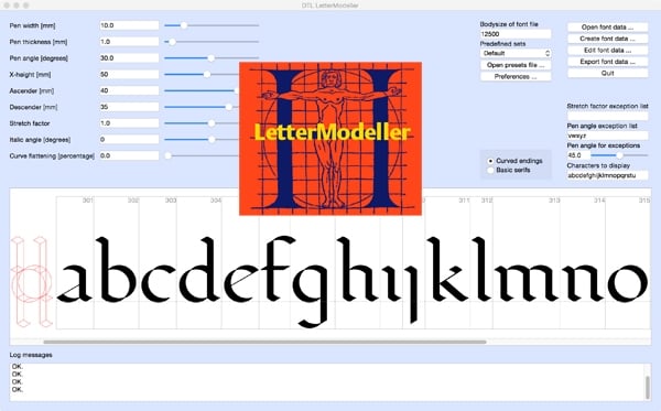
The structure LeMo is based on my expertise as Senior Lecturer (calligraphy and type design) at the Royal Academy of Art (KABK) in The Hague since 1987, and as Professor and Research Fellow at the Plantin Institute of Typography in Antwerp since 1995. The models generated with LeMo can be used as a direct basis for type design, or just for generating examples for writing with the broad nib. The new LeMo V5 can be downloaded for free from here.


This new version of LeMo has become a highly flexible and adjustable full-functioning font editor. It contains many nifty features, such as intelligent scaling and stem adjustment. In previous editions of LeMo the glyph editor was restricted to the newly generated glyph database, i.e., as soon as this database was closed it was not possible to edit it anymore but version 5 imports .be files. However, there is a restriction still: currently only one font file can be edited at the time.

LeMo V5 cannot open .ufo files; it will only import .be files. Converting to .be is fairly simple with DTL OTMaster (Light) though: just import an OpenType font in OTM and export it as .be file. The export of .ufo files is a bit different from what most type designers will be used to: for storing the data a folder has to be created and selected from the export dialog. All fontdata has to be stored in this folder and the folder will automatically get the suffix ‘_ufo’. To convert the folder into a .ufo container, the underscore in ‘_ufo’ has to be replaced by a period. I have to admit that this is not ultimately elegant but it works. An improvement in comparison with previous LeMo versions is that for the export of OpenType (CFF and TTF) fonts or .ufo files, a hard-coded default Character Layout (.cha) file is used now. Of course, any other .cha file can be selected too.


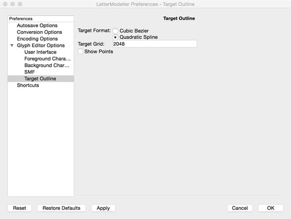
In LeMo V5 cubic splines are converted on the fly to quadratic ones and can be shown in the background, which makes it possible to directly check and control the conversion.


A couple of functions make the design and font-generation process much easier in comparison with previous LeMo versions. For instance the calculation of the bodysize is now based on the values in the main, i.e., first, window. This means that the em-square is always calculated from the distance from the top of the lowercase l to the bottom of the lowercase p. If parameters are altered in the main window, automatically the em-square will be scaled accordingly. The ascender, descender, and x-height values from the main window will appear in the font header. Of course, these calculated values can be altered manually in the font-header dialog. 


LeMo V5 preferably requires a large screen and this implies that the display of the many functions is not really optimised for laptops. Hence, when you work with for instance a MacBook it is advised to resize the icons from 36 to 24 pixels to make every function accessible on the screen. Otherwise some ‘save’ and ‘apply’ buttons will be unfortunately out of reach. To make the new icon size effective the program has to be restarted. A three-button mouse will make it much more convenient to place or change contour points and contours (especially in the ‘Quick Mode’) and to position horizontal, vertical, and diagonal guidelines.

Please note that when the glyph editing window is opened for the first time the ‘View’ –> ‘Dock Widgets’, such as the one containing the editing tools, are covering each other. The tabs for controlling the layering will unfortunately not be visible on a laptop screen. To circumvent this limitation, double-clicking on top of the Dock Widgets will make them movable.

Enjoy!

Photo dumping for Daily Type Specimen

$
0
0
I need to find somewhere to dump the original files for Daily Type Specimen. Given the way things have been going with Yahoo I’m not sure that Tumblr and/or Flickr will be around in the long term. I’d also like people to be able to download a big collection of files without going through the bulky UIs of Flickr, Wikimedia Commons, or Archive.org. File lockers like Mega are out for a long list of reasons. I’m partial to just dumping it all on an FTP site somewhere but I don’t want a server running in my basemen. Github seems like a good option, but they have a soft limit of one gigabyte, and Daily Type Specimen is four gigabytes. Any other good options?

Roijer

$
0
0
"Roijer" started as a handmade lettering logotype designed for "Peter Röijer" vintage perfume brand. Started now as a titling serif typeface. The main idea is create unconventional uppercase groups as similar as close to the personalized oldstyle lettering design do.

As a first step, I started with uppercase only, doing two models on each glyph, in letter one go into  UC-box and other into the lc-box, as you can see the 1st couple 'R' below here.


Mixing and matching italic and roman shapes in cyrillic fonts

$
0
0
I came across this rather interesting logo of Interfax, the biggest news agency of Russia.
It’s not so much the graphic quality of the logo - which I’ll kindly leave to your judgment - but the choice of glyph shapes that interests me.


The normal way to write interfax in russian would be интерфакс, but instead of и, the latin character u is used, and instead of ф there is this rather exotic mix of ф and the latin f.
I understand that the u shape is basically the traditional italic version of и and that even the ф can be somewhat explained if you look at the roman/italic comparison below.

But here’s the question:
Mixing and matching italic and roman shapes in one alphabet has become quite acceptable in latin scripts, but does the same count for cyrillic? Even in fonts for what I’d call ‘serious’ usage?


An accurate Vietnamese alphabet?

$
0
0
I’m looking for an accurate list of letters in the Vietnamese alphabet. The list built into Glyphs seems to be incomplete, as do Adobe’s fonts. For example, trying to set Genesis with fonts that support Vietnamese often results in ḿ ṇ ṛ missing. Online lists of the Vietnamese alphabet are often missing these and other letters, like ø. The Scriptsource list of characters for Vietnamese fonts contains many characters not in Vietnamese because it includes complete codepages containing characters used in Vietnam. Is there a reliable list somewhere? Are ḿ ṇ ṛ and ø just errors in old text?

Extended Cyrillic breve form?

$
0
0
I'm looking at a number of extended Cyrillic diacritic letters, i.e. characters used for non-Slavic languages, and am wondering about the appropriate/preferred style of the breve mark in these glyphs. The characters in question are

04C1 Ӂ CYRILLIC CAPITAL LETTER ZHE WITH BREVE
04C2 ӂ CYRILLIC SMALL LETTER ZHE WITH BREVE
04D0 Ӑ CYRILLIC CAPITAL LETTER A WITH BREVE
04D1 ӑ CYRILLIC SMALL LETTER A WITH BREVE
04D6 Ӗ CYRILLIC CAPITAL LETTER IE WITH BREVE
04D7 ӗ CYRILLIC SMALL LETTER IE WITH BREVE

The form of breve sign used for the Slavic characters

0419 Й CYRILLIC CAPITAL LETTER SHORT I
0439 й CYRILLIC SMALL LETTER SHORT I
040E Ў CYRILLIC CAPITAL LETTER SHORT U
045E ў CYRILLIC SMALL LETTER SHORT U

is conventionally larger than the Latin breve, and stylistically quite different in serif types. I am wondering whether it is appropriate to carry this convention across the extended Cyrillic diacritic characters, i.e. to have a single Cyrillic-specific breve form, or if any of the language communities using these characters have a preference for a breve that follows the Latin model? Anyone have any information?

Fig. Typical stylistic difference between Latin (left) and Cyrillic (right) breve forms in serif type:


Skry, an experimental sans

$
0
0
Hello,
I'm a hobbyist type designer, not really experienced but toying with FontForge for about 2 years and previously with other programs for as long ago as 5 years.
It's the first time I tried to make a more or less regular sans font, but of course I diverged. I never payed attention to simple exercises like that, so even this time I needed an "idea" to keep me going. What I imagined was a font where all terminals on letters like c, s, a, e, usually cut horizontally, vertically or diagonally, would be cut diagonally, but along the other diagonal than usual. Let me know what you think.
For now it's just the lowercase and some punctuation (which is quirky, too, btw) because I wanted to get some feedback before I commit more sins.
I'm not sure how the unsual terminals impare spacing, at first sight I thought it was cool how letterpairs like "ry" look like (that's why I chose a name like that), but on the other hand it looks a bit weird.
I'm not very fond of the current /s, is it too light in the bold?
I know the diacritics are not ideal, I wanted to make them robust but I think they are hang too low above the base letter. Is it okay if they would overshoot the ascender line?
_________
Edit: I updated the pdf, the previous one was of poor quality.

Out of print books

$
0
0
Hello type designers, show me a sign though – I was book hunting trying to find: 
The stroke: theory of writing Gerrit Noordzij
Counterpunch: making type in the sixteenth century, designing typefaces now Fred Smeijers
I can't get them any more, that's a sign of the times though.

I have contacted Hyphen Press and no future plans to republish, if anyone comes across them on the cheap and not going for crazy money could you please message me.

Regards,
Luke

TypeTogether is hiring

$
0
0

TypeTogether is looking for an experienced font engineer in a part-time capacity. The expected working time is about 20h per week. This is a rare opportunity to join the TypeTogether family in a permanent position. We pride ourselves boosting strong inter-personal relations and encouraging a fun yet challenging working environment.


Description of work:

1.  Font (desktop & web) post production: development, revision and testing of font files: includes OpenType feature coding, matrics, header and naming tables, troubleshooting and software performance control.

2. Technical support: verify and fix reported issues about font performance.

3. Communication and reporting: Collaborate with the design and quality assurance team on the creation of procedures and processes to streamline font development.


The applicant should be proficient in Fontlab and Glyphs with optional experience in Robofont, Python, VTT, VOLT.

Skills in type design drawing are desired but not required.

The applicant should speak good english and work independently and reliably in an international team of fun and motivated people.


If interested please send you applications to info@type-together.com including a resumé and salary expectations.


http://www.type-together.com/index.php?action=portal/viewContent&cntId_content=3440

Trying to generate a self-created True Type font.

$
0
0

Trying to generate a self-created True Type font.

When validating or generating a TTF I'm getting a bunch of characters with "There is another glyph in the font with this unicode code point". This happens after hinting, removing overlaps, correcting directions... It's the only thing that comes up when validating the font, everything else seems to be fine.

Is this a real issue I should be concerned about and if so how do I solve it?
The FF Validation messages don't have any details to them other than the name of character with the respective issue as quoted above in bold. By clicking on that list item it opens the respective problem character (for example LATIN CAPITAL LETTER E) but I don't see any reference as to where the (other) duplicate character sits and I don't understand what exactly I'm supposed to do. Am I supposed to just erase that character and hope I killed the right one of the two? Forgive me in case I don't see/understand the obvious...

I tried to detach the respective characters. Tried to restart XQuartz and FontForge. But problems/messages persist.

I created the font from scratch. I use my own all Western European Character set (incl. all accents and some ligatures).

XQuartz 2.7.11 (xorg-server 1.18.4) FontForge 18:35 PDT, 2 April 2016 Mac mini (Late 2014), 3GHz i7, 16GB memo macOS Sierra 10.12.2

Any help is appreciated! Thank you!


Can't generate .OTF file ...

$
0
0
Hello, When I try to generate a OTF-fontfile from Fontlab, I I get this alert. What's going wrong? Thanks a lot for kind assistance! Best, Morten


Viewing all 4153 articles
Browse latest View live