I'm a UI/UX designer by trade. This will be my first serious typeface I've worked on.
![]()
![]()
![]()
Thank you!
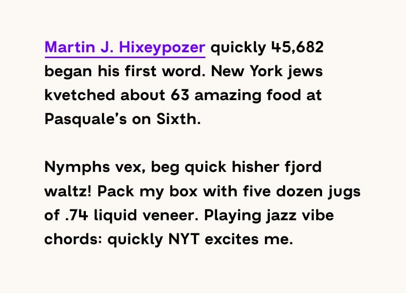
The brief of Norse Sans is to be a comfortable read on displays, both body sized text and larger titles. Because of this I wanted the font to be neutral and sans quirks. That is also why I decided to keep the finials straight à la Helvetica. It's geometric nature gives each letter a nice extended width look, which I like. The wide side bearings helps the font to be breathable without the need to adjust the tracking.
My schizophrenic typeface borrows inspiration from fonts like; GT-Haptik, Futura, A2 Regular and Styrene.
My eyes have grown very tired of this font. And I'm super keen on hearing what you guys have to say about it!


Thank you!