Dear experts,
I greatly value your knowledge and experience, and so I turn to you for advice. A bit of background. I'm a total novice, and I'm looking to very slightly change a font for my own, purely personal use in private. As I age, I've come to think I need to use fonts that are darker, and sharper against the white paper.
I have a question about MT Fournier. I like it, but would like to give it a bit more heft. To help explain what I mean, think of a text face that comes in 'grades' (e.g., Aria Text or Mercury Text). Let's say MT Fournier is Grade 1. I'd like to beef it up to a Grade 2 or 3.
I must rely on crude, rustic methods. Like, using the Effects action in Fontlab 5. Thicken the strokes by a few points, and that's it. (Go ahead, laugh. It's ridiculous, I get it, but I'm not looking to do art here. I'm just trying to change a leaking faucet in my kitchen, as it were. So, laugh away.)
Now for my question. Suppose I use the Effects/Bold action above. Should the number of points for the Vertical scale be the same as for the Horizontal scale? I mean, if I wish to thicken the stroke by 2 extra points on the horizontal, should I thicken it by 2 points vertically as well? Or is there some secret formula -- for ratios between H and V scales -- that I should learn?
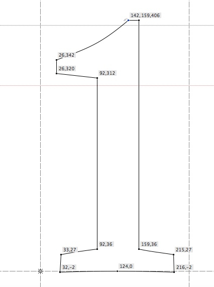
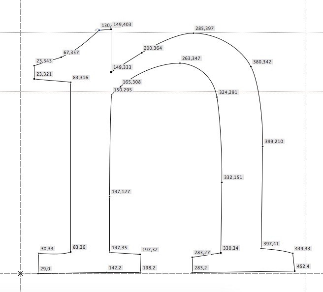
Again, my aim is to get something with the same average contrast as MT Fournier, just a bit darker. For edification, here's what the numbers look like, in the version you buy from MyFo. (BTW, the irregularity in the glyph position is theirs, not mine.)
![Image: https://us.v-cdn.net/5019405/uploads/editor/jy/gvxcstm45yzg.jpeg]()
![Image: https://us.v-cdn.net/5019405/uploads/editor/pl/kirq0pv50dki.jpeg]()
Thank you kindly for any advice you may have for me!
I greatly value your knowledge and experience, and so I turn to you for advice. A bit of background. I'm a total novice, and I'm looking to very slightly change a font for my own, purely personal use in private. As I age, I've come to think I need to use fonts that are darker, and sharper against the white paper.
I have a question about MT Fournier. I like it, but would like to give it a bit more heft. To help explain what I mean, think of a text face that comes in 'grades' (e.g., Aria Text or Mercury Text). Let's say MT Fournier is Grade 1. I'd like to beef it up to a Grade 2 or 3.
I must rely on crude, rustic methods. Like, using the Effects action in Fontlab 5. Thicken the strokes by a few points, and that's it. (Go ahead, laugh. It's ridiculous, I get it, but I'm not looking to do art here. I'm just trying to change a leaking faucet in my kitchen, as it were. So, laugh away.)
Now for my question. Suppose I use the Effects/Bold action above. Should the number of points for the Vertical scale be the same as for the Horizontal scale? I mean, if I wish to thicken the stroke by 2 extra points on the horizontal, should I thicken it by 2 points vertically as well? Or is there some secret formula -- for ratios between H and V scales -- that I should learn?
Again, my aim is to get something with the same average contrast as MT Fournier, just a bit darker. For edification, here's what the numbers look like, in the version you buy from MyFo. (BTW, the irregularity in the glyph position is theirs, not mine.)


Thank you kindly for any advice you may have for me!