I have two questions about MT Fournier. I'll ask here one, and post the other under another category, where it belongs.
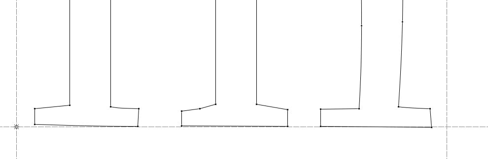
I really like MTs version of Fournier. But, recently I took a closer look at its outlines, and I was struck by how irregular they are. For instance, here's the bottom half of the lowercase M:
![]()
And here's the FI ligature glyph.
![]()
I was wondering, is this by design -- did Monotype mean to make them so unlike and irregular? Or is it just sloppy digitization? I saw some of that in old Berthold types, and I just assumes they were desperate to transfer things to digital before they'd go under. But, what gives, Monotype?
I really like MTs version of Fournier. But, recently I took a closer look at its outlines, and I was struck by how irregular they are. For instance, here's the bottom half of the lowercase M:
And here's the FI ligature glyph.

I was wondering, is this by design -- did Monotype mean to make them so unlike and irregular? Or is it just sloppy digitization? I saw some of that in old Berthold types, and I just assumes they were desperate to transfer things to digital before they'd go under. But, what gives, Monotype?