Just our of curiosity - after you've released a new font what's the soonest you've seen it on a file sharing website. 12 days for me.
↧
Fonts in the Wild
↧
Exclamation comma
I was wondering. Is there a designated unicode position for exclamation comma and question comma (https://en.wikipedia.org/wiki/Punctuation#"Question_comma",_"exclamation_comma") ? If not, what position would you say it's best to place them and how would you imagine them being accessed (e.g. with an open type substitution rule)?
↧
↧
The 2018 Font Purchasing Habits Survey Results
The 2018 Font Purchasing Habits Survey Results by Mary Catherine Pflug
Haven't found a discussion on this survey's completion on TypeDrawers and thought I'd share it here in case some of you missed it, as I believe it is a very valuable resource.
Do you find any findings or trends surprising? Do you think going forward, the survey should zero in on certain areas?
For example, I'd love to find out more about how people actually seek out fonts (other than just where); by tags, similarity, style, available promotions, direct search, and so on.
↧
Free sites stealing/pirating your fonts for download
I've already had to send DMCA notices, but what a hassle against sites like UXFree and others, that steal your fonts from distributor sites and make them a "free" download. In one case they removed it and then a few months later uploaded the same font family, but with a different url.
Anyone else continually run into this and know of any better solutions?
Anyone else continually run into this and know of any better solutions?
↧
Printer recommendations for proofing?
What printer would you recommend for proofing purposes, today? $500 or under would be nice since I'm an independent designer.
Ideally, the minimum requirements would be:
- true 1200 dpi,
- Adobe PostScript 3
- laser printer technology
Are there other minimum requirements I should be considering?
In the U.S., the low-end cost for 1200 dpi plus Adobe PostScript 3 seems to be above $1,000. To get something around the $500 mark and below usually means going with the vendor's PostScript 3 emulation. In the past, I wanted to stay away from most emulations. If I lived in Australia, I'd probably try out the Fuji Xerox DocuPrint P355d (which hits the under $500 mark with Adobe PostScript 3 and 1200 dpi).
http://www.fujixerox.com.au/products/printers/monochrome-printers/docuprint-p355d/dpp355
Are there printers with PostScript 3 emulation and 1200 dpi that work well enough? 2400 dpi, though nice to have, seems to make the price increase a lot.
Thanks!
[Posting in Software since there wasn't a Hardware category.]
↧
↧
Baguettes ... early days
 This is Baguettes (working title).
It's the first work I've felt confident enough to show you all.
My key question: am I heading the right direction, please?
Plenty of books say that you should make sure you get your early glyphs as good as possible, to avoid multiplying mistakes across the whole set of characters. What should I change, please, to prevent this?
Technical stuff: I created this using Glyphs. I drew some caricature extreme light and heavy weights (thanks @Ray Larabie for that tip); the third line is my "regular" that I designed before I learned about the possibilities of interpolation.
Best wishes, and thanks in advance. Andrew.
↧
Type Foundries offering printed specimens
Hi there,
As collector of printed type specimens I would like to know which foundries you can mention who are currently offering (ideally offset) printed type specimens.
BTW, we have recently published one: www.re-type.com/products/
Thanks in advance.
R.

↧
Quotes for an article
Given our issues with IP theft, I am expanding an article I was originally writing on Font Installers to include font theft as well. Thus, I'm looking for anyone who would like to be quoted in regards to this article. If you're interested in doing so, please feel free to comment below and let me know I can use it in my article. I'll have the draft up probably around Friday or so, so everyone can see and add points to it, though if your comment is overly long I might have to edit for clarity and length (you know how that goes.)
Thanks for any assistance!
Thanks for any assistance!
↧
Horace Carr
On the Internet Archive, I came across Bernard Shaw on Modern Typography, reprinted from The Caxton Magazine, by Horace Carr at "The Printing Press" in 1915. It piqued my interest, because it was in a very nice Jenson typeface, and I hadn't known that there were that many options of that kind available to printers then.
It was only a few pages long, with pairs of facing pages followed by pairs of blank pages. And at the end there were some testimonials to his work, so I assume it was a sample showpiece.
A web search turned up some basic information. As a young boy of 14, he came to Cleveland in 1883 and entered the printing trade as an apprentice. He started his own printing shop, "The Printing Press", in 1889, and he passed away on April 12, 1941.
As well, there definitely were indications that he was considered a master printer. But I haven't been able to find out much information about him.
↧
↧
Grilli Type Foundry seeking a junior type designer (anywhere in the world)
"Junior Type Designer (3 Months)
Grilli Type is seeking a junior-level type designer on a three month contract basis for 4 days a week.
You will be assisting us with custom type projects, work on customizations and expansion of character sets and scripts support of our retail library, and help us with QA testing and metrics.
As we are a completely remote company, you can be situated anywhere in the world. We expressly encourage members of underrepresented groups in type design to apply for the position.
Your profile:
• Work in Glyphs
• More than one year of experience in type design
• Good knowledge of the Latin script
• Started exploring one or more non-Latin script (Cyrillic, Greek, Arabic, Thai, etc.)
• Take directions & feedback well
• Enjoy a collaborative way of working
• Have a very strong eye for details
• Good understanding of contemporary aesthetics
• Advanced+ written English skills
• German skills appreciated but not necessary
• Ideally you are available to start by mid-April
We offer:
• Completely remote team: you can work from anywhere
• Part time: Four days / 32h per week
• Sane work hours: you work the agreed hours and not more
• A supportive environment to grow your skills
• Pay commensurate with your experience and location
• Three month freelance contract
• Extension of that contract into a long-term position may be possible, but is not in any way guaranteed.
Apply:
You can apply for this position by filling out (https://airtable.com/shrSVpIYGNr2pvS3E). Applications are open until Friday, March 22. You can email tobias@grillitype.com at any time if you have any questions about the position."
↧
Moxic
Hello,
a generic grotesk going up to 11 (file attached below). Will have italcs. Family name is open for debate.")

a generic grotesk going up to 11 (file attached below). Will have italcs. Family name is open for debate.
")

↧
blend tool fontlab
in fontlab 5 there was the blend tool for easy interpolation. can't find this in fontlab 6 or FL6-help. how does this work now? i am not familiar with MM or variable fonts. any comments?
↧
Robofont or Glyphs for Type design
Hello Everyone,
I am new to using a fully functional font editor and was wondering which one would be the best bet to start with. Robofont or Glyphs?
I am new to using a fully functional font editor and was wondering which one would be the best bet to start with. Robofont or Glyphs?
↧
↧
Plex; IBM's new font identity model
Saw this news item.
It is not particularly new that a company has commissioned a new font for its own exclusive use in order to enhance its own corporate identity.
But while this may not be a first, making a new font, to be used by the company, but also making it freely available as open source... is something I've seen for the first time here.
↧
Name table ID's 16 and 17
Does anyone know why MacOs prefers to use the name id's 16 and 17 for the Windows platform over the id's 16 and 17 for Macintosh the platform? Adobe InDesign on Mac also uses the id's for Windows.
↧
Font production frustrations and solutions
As someone still becoming familiarized with everything that goes into the production stages of fonts, I'm realizing more and more that there's a lot that goes into turning a *typeface design* into a rock-solid *font* than I would've guessed when I started out. And yet, with everything I've learned, I still occasionally run into issues where my fonts don't always work as expected on different operating systems and apps. One of my deepest frustrations is the rapid pace that font support/expectations are evolving and, thus, what used to be correct is no longer the best thing to do.
So, I'm curious if anyone would be willing to share a thought or two about issues you've run into trying to make reliable fonts that work as cross-platform/app as needed and what you did about it. What tools do you find most useful and do you find that you become aware enough of what the tools help you with that you no longer need them?
So, I'm curious if anyone would be willing to share a thought or two about issues you've run into trying to make reliable fonts that work as cross-platform/app as needed and what you did about it. What tools do you find most useful and do you find that you become aware enough of what the tools help you with that you no longer need them?
↧
Ultra-compressed flat-siders
In times of the ancients, sans-serif condensed, compressed, ultra-compressed fonts usually had flat sides. If you look at Univers as it gets narrower, curves get squeezed until they become completely flat. These ultra-compressed fonts often had higher stem/gap uniformity. There were strange situations like Helvetica Compressed where the flat sided font barely resembled Helvetica. When I see new compressed fonts, I don't see them going completely flat much anymore. Helvetica Neue retains curved sides but appears to have some degree of gap normalization applied to the heavier compressed weights. My question is: why? Obviously when working with interpolation, a sharp transition from curved to flat requires extra work. Do designers who use type prefer consistent round sides to going totally flat? Nobody cares?
To my eye, there's a certain threshold where flat sides and uniform gaps simply look better. I can't picture Univers Ultra-Compressed with curved sides, no matter how subtle.
To my eye, there's a certain threshold where flat sides and uniform gaps simply look better. I can't picture Univers Ultra-Compressed with curved sides, no matter how subtle.
↧
↧
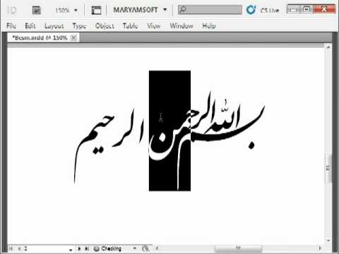
Arabic Design Contest
Dear Friends,
1st Prize: QalamBartar plus 20 unique and dynamic Arabic fonts
2st Prize: QalamBartar plus 10 unique and dynamic Arabic fonts
3rd Prize: QalamBartar plus 05 unique and dynamic Arabic fonts
Happy Designing
You are cordially invited to design one Arabic font to win our tool, namely "QalamBartar" shown at ![image]() and elaborated at https://ahmedgraf.com/2018/06/12/qalam-bartar/ plus a number of unique and dynamic Arabic fonts out of these http://maryamsoft.com/FontShop/
and elaborated at https://ahmedgraf.com/2018/06/12/qalam-bartar/ plus a number of unique and dynamic Arabic fonts out of these http://maryamsoft.com/FontShop/
 and elaborated at https://ahmedgraf.com/2018/06/12/qalam-bartar/ plus a number of unique and dynamic Arabic fonts out of these http://maryamsoft.com/FontShop/
2st Prize: QalamBartar plus 10 unique and dynamic Arabic fonts
3rd Prize: QalamBartar plus 05 unique and dynamic Arabic fonts
The winning fonts will be added to QalamBartar and copyrighted by http://maryamsoft.com
Deadline: 20.08.2019
----------------------------------------------------------Happy Designing
↧
Dark stencil
This design is derived from handlettering on a T-shirt I did recently.
![]()
The objective was to keep the letters fat so that the line design could be drawn inside. I made some trials with the ornaments (a-z and some punctuation) and it looks promising, though the shape of the lines evolved in another direction. I tried to make the ornaments to mimic the shape of the letters and make up for the legibility lost because of the stencil effect.

For now though, I'd like to ask for critique of the solid version.
https://onedrive.live.com/?authkey=!AKJiwOswpLaTQcc&cid=F7DFB60722D34AE9&id=F7DFB60722D34AE9!241427&parId=F7DFB60722D34AE9!240950&o=OneUp
↧
Automatic spacing/kerning: an attention-based approach (collaborators wanted!)
Hello typophiles,
I've been hacking on a new approach to letterfitting and thought perhaps some of you might be interested (seeing as Simon got some good discussion out of his Atokern thread). It's inspired by a deep learning concept (attention masking) but doesn't actually use a neural net, because I don't think neural nets are the right solution – we need an understandable model with fully adjustable parameters, not an inscrutable black box.
I've been hacking on a new approach to letterfitting and thought perhaps some of you might be interested (seeing as Simon got some good discussion out of his Atokern thread). It's inspired by a deep learning concept (attention masking) but doesn't actually use a neural net, because I don't think neural nets are the right solution – we need an understandable model with fully adjustable parameters, not an inscrutable black box.
I have some preliminary results, and what's needed now is a solid tool to evaluate how different implementations for the various parts of the model would affect the quality of the output depending on font type (e.g. display-size hairline italic sans vs. caption-size blackletter). Since I don't think I'll find enough time to finish this by myself in the near future and didn't want this to languish on my hard drive forever, I wrote up what I have so far as a blog post. I'm happy to answer any questions here if my explanations are unclear.
Perhaps one of you is intrigued enough and willing to help me tinker with this as a team?
↧