Quantcast
Channel: TypeDrawers
Viewing all 4153 articles
Browse latest View live

svg fonts

$
0
0
Could someone enlighten me about svg fonts please.
How much support do they have – is it the future?
And Is it possible to have each glyph as a high res image?
Thanks!

Somebody Agrees with Hrant about Black-Letter

$
0
0
...about something I had imagined that hardly anyone would agree with him about. (His views on the importance of cultural authenticity, I believe, are widely shared these days.)

And it isn't just anyone who is in agreement with him. It's Stanley Morison, no less.

Here's the quote, from his First Principles of Typography:

"It does no harm to print a Christmas card in black letter, but who nowadays would read a book in that type? I may believe, as I do, that black letter is in design more homogenous, more lively and more economic a type than the grey round roman we use, but I do not now expect people to read a book in it. Aldus' and Caslon's are both relatively feeble types, but they represent the forms accepted by the community; and the printer, as a servant of the community, must use them, or one of their variants. No printer should say, 'I am an artist, therefore I am not to be dictated to. I will create my own letter forms', for, in this humble job, no printer is an artist in this sense."

While he is not at all sanguine about the prospects of shifting the general preference, and in this respect he may differ from Hrant, he is in agreement that black letter is "better", in whatever sense one wishes to take that term.

I had thought it to be obvious that black letter was objectively less legible (and, indeed, far less legible), and one could demonstrate that by, for example, subjecting specimens of black letter and Roman type each to a two-dimensional Fourier transform, and observing the much greater high-frequency content in the former.

[otvar] Computing width for text in variable webfonts

$
0
0
I have been working on a new hyphenation-and-justification engine for variable fonts; you can find the code here and also view a demo site. But I've come across a problem I don't know how to solve.

It works beautifully for some fonts (Skia for instance) but not for others, and I've kind of worked out what the root problem is. I am using the CSS font-stretch property to set the desired width of text to a given percentage. For example, if I have a word which occupies 207 points and for line breaking purposes I need it to occupy 124 points, I set font-stretch to 60%. Now I'm testing using DJR's Fit, which can most certainly compress to 60% of normal and even less, but with font-stretch set to 60%, it still occupies 145 points - the actual compression is 70%.

From my point of view, the browser is misbehaving: I asked for 60% compression, I got 70%. But I wonder if underlying that is the arbitrariness of the extremes of the wdth"axis: Fit has a "skyline" named instance which has a wdth of 0, but it clearly has some width, while its "ultra extended" instance with wdth 1000 is somewhat less than 10 times wider than the regular (which itself has wdth 110!). So the font-stretch property really has no hope of getting it right.

How do I set a piece of text in a variable font to a particular width in a browser?

I guess the dumb-stupid solution is to set a piece of text at font-variation-settings: 'wdth' (whatever the minimum is) and measure it, then at font-variation-settings: 'wdth' (whatever the maximum is) and measure that, and interpolate between the two. But I'm not even sure how to get the minimum and maximum values from the font in a browser. Any ideas?

CSS Working Group agrees to add a whole lotta Math

$
0
0


"The CSS Working Group agreed this morning on adding many math functions. We now have:

• calc()
• min()
• max()
• clamp()
• sin()
• cos()
• tan()
• acos()
• asin()
• atan()
• atan2()
• hypot()
• sqrt()
• pow()

The face of CSS is rapidly changing."

This is big news for doing flexible typography with variable fonts :)

Font metrics settings for desktop and web fonts

$
0
0
Hi there,

I would like to know if this classic approach to font metrics settings for desktop is still considered to be valid. Are you still using this scheme? How do you adapt it for webfonts?

In accordance with this recommendations some people are switching to the following approach for desktop and webfonts:


What do you think of it? I am looking forward to hear your opinions.


Internal leading in vertical metrics. Is it necessary?

$
0
0
Preface: I'm aware of the many strategies out there for determining vertical font metrics, including how to account for some default leading, so know that my question isn't about the *how*. It's more about the *why*.

Question: When it comes to vertical metrics, is it useful (necessary?) to program-in a reasonable amount of leading, or do you find that leaving the values as close to "solid" as you can works better because apps will choose their own line spacing anyway? I know that many apps have no capability to adjust line spacing, so some internal leading would be useful. Maybe that answers my own question, but what is your experience on the matter? What other pros/cons should a designer like me be aware of when planning internal leading?

Robofont or Glyphs for Type design

$
0
0
Hello Everyone, 
I am new to using a fully functional font editor and was wondering which one would be the best bet to start with. Robofont or Glyphs?

Not able to upload fonts on Prosper (MyFonts)

$
0
0
Hi,
I am trying to submit fonts to MyFonts on Prosper. The native font validator shows error that fonts cannot be Installed on MacOSx/MacOS" and shows message "Your font may have serious errors. Please check your font files." I have uploaded files in ttf format. Tried with otf too. I use Fontlab VI Windows to create fonts.
I cannot understand what could be the problem. Anyone with experience please help. Thanks

Geranium : inspired from Venetians

$
0
0
Hi,

This is my first post here. I am not  professional typedrawer nor I have the ambition to become that. I did my career in horticulture and botany, with the rose and its history and botany as a speciality. Now I spend my time at writing fictions and… trying to draw some typefaces who matches the spirit of my writings. And as this spirit has something in common with the humor and burlesque of novels from the humanist area (I think at Rabelais, Cervantès…) or somewhat later (Cyrano, Jonathan Swift…) I would like to try some Humane or Venetian type drawing. For Geranium my inspiration came from several modern interpretations of the Venetians (Hadriano, Centaur, High Tower…) but also from the observation of Janson characters. And my challenge was to work without any angle and with few straight lines. I decided this organic look for several reasons : last years I worked a lot at reproducing different optical sizes of George Auriol typefaces (I will perhaps submit them as another post later) and on November 2015 I was disturbed by political violence which came around and as that was the moment where I decided to begin the drawing of my first personal text font I decided that it should be sweetly organic. Of course I will do something different later but this one will keep this character.

ivan louette, louvain-la-neuve, Belgium

Elemaints - A Serif Family with Optical Sizes

$
0
0
A long time ago (2010) I have started a new typeface written in METAFONT (see http://www.typophile.com/node/73827). I interrupted the work because I had to investigate further in METAFONT and parametric type design (e.g. https//www.tug.org/TUGboat/tb37-3/tb117romer.pdf or https://tug.org/TUGboat/tb35-1/tb109romer.pdf or http://typedrawers.com/discussion/2342/funtauna-rectangular-slab-serif).
But I have never abandoned the original project and have always been working from time to time for this typeface. Taking the updated METAFONT sources, I have produced some master fonts. At the moment, work is concentrated on 2 of them: The display face and the tiny face.


I have refined both faces in Fontforge and have interpolated the optical axis Tiny-Caption-Regular-Subhead-Display:


The intended use of the typeface (which I call Elemaints) is the use in scientific texts. The glyph forms are mainly based on french renaissance antiquas like Sabon or Albertina. The x-height is equal to the x-height of Times New Roman. The proportions are very similar to Minion. Therefore, the look of Elemaints may resemble Minion, altough every single glyph was constructed freshly. One intended difference to other french renaissance antiquas may be the serifs, which always end rectangular:


Elemaints is not meant to be a revolution but a free antiqua with optical sizes for scientific texts.

Any suggestions (except kerning, which is not done yet) are welcome (glyph shapes, proportions, rhythm, details, spacing, ...).

Looking for advice with Cyrillic locl feature

$
0
0
Hello,

I'm looking for advice.

I'm working on font that contains Cyrillic characters and I'm having issue with locl feature.

There would be 3 Cyrillic sets: Russian, Bulgarian and Serbian.

Default Cyrillic characters (ISO 8859-5) would be Russian.

Since Serbian language is not supported (yet) by Adobe, so it doesn't make sense to place it under lolc feature, I'm not sure under what OT feature to offer it, to make it accessible for users.

I already use calt and salt features for another characters.

The only features left unused in Illustrator CS6 are dlig, cswh, titl, ordinals and fractions.

Does it make sense to place Serbian characters under any of these features (except in ordinals or fractions)?

Is there maybe some more logical solution for this?

Thanks


Never Mind Starling

$
0
0
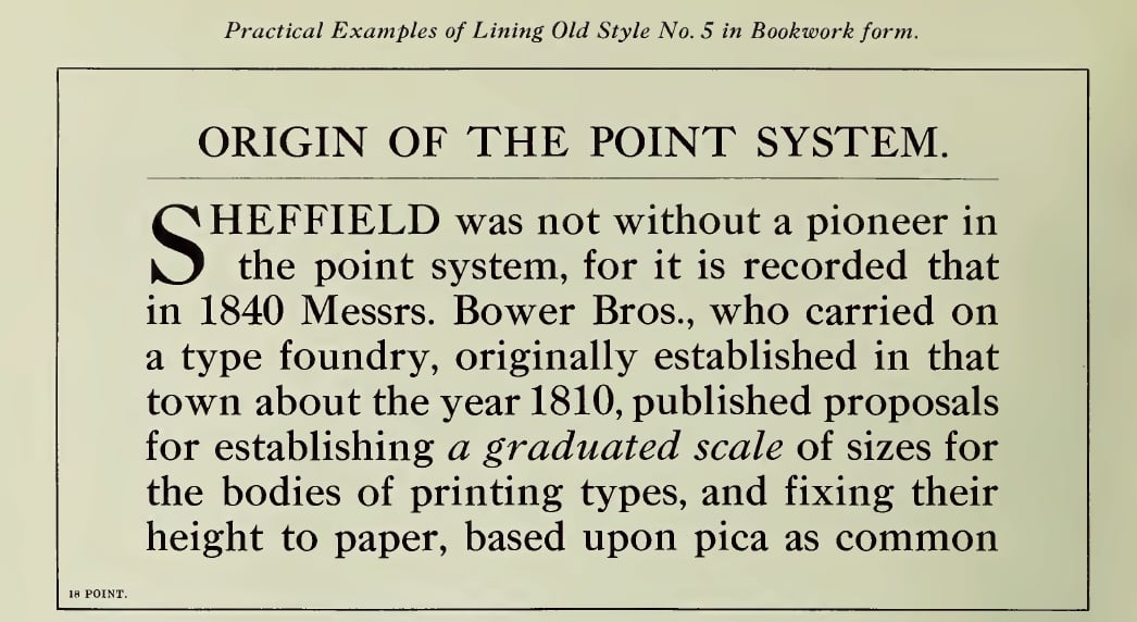
I was looking at a digital copy of the 1908 Stephenson Blake specimen book in its Canadian edition.

Their Lining Old Style No. 5 looked... rather familiar.


Maybe there are aspects in which it is greatly different from the Times new Roman, but at least it gives the same general impression, even if it is likely derived from Caslon as opposed to Plantin's type.

Is the Type Directors Club on a retro trip?

$
0
0
Hope Sans – The Type Directors Club Typeface Design Competition Winner. I’m aware that calling it a “retro trip” may be controversial. After all, virtually all typeface designs in this century are replays of what previously existed, in one form or another.

Why do you think the TDC chose this Swash-heavy typeface as a winnner? Do you find it odd or justified, in this day and age? What are your thoughts?

https://www.monotype.com/resources/font-stories/meet-hope-sans-a-type-directors-club-typeface-design-competition-winner/

New typefoundry specialized in Scripts

$
0
0

Dear friends of lettering and typedesign,


After 20 years of commercial logotype «production», I’m planning to establish a new typefoundry next year, spezialised in «Scriptfonts» Before I started as a freelancer in Paris, I spent already a few years at URW/Hamburg in the division of typeproduction, but I have no real education as a typedesigner. 

The last years I began with scetches, realising a «Hamburgefonstiv» or «quick brown foxes» in some styles of the logotypes I made for my clients. Over the time a great appetite developed and I’m now decided to continue and to specialize in type design in the future.

All these years I had not really contact with typedesigners and no insight into the typedesign scene.
I feel insecure because I’ve no idea what happened in the production, commercialisation and selling of fonts the last years...
In the past I feel secure to identify and to evaluate quality and selling possibilities of fonts, but today all seems possible ...

I will design fonts with a «calligraphic, hand-lettered, handwritten touch».
Fonts with a «human, vibrant and personal» character...

Do you have personal experience with your own scriptfonts ?
Will there be possibilities to create customfonts ?

I want to ask your evaluation (if possible) of my future plans to specialize in Scriptfonts.
What do you think about???

Many thanks for your comments in advance.

Peter Becker


FWIW Figma is sensitive to typolinegap

$
0
0
A client asked me to investigate the different behavior of text between Sketch and Figma, when text is centered vertically.

The font I had to test had a typolinegap value set. When I made a quick test version with the value set to zero, all aligned well in both apps.

:)

What are some inexpensive methods for font marketing?

$
0
0
I am an amateur type designer, and have just published a font. I’m not doing this full-time, so it’s more of a side-gig. Now, what are some simple methods of promoting the font online? I don’t have a budget, at least not yet. I’m currently relying on forums and other online communities for promotion, but currently seeing not much of traction, no surprise there.

What are some other methods of driving up the exposure?

R&D Tax Credit

$
0
0
Has anyone used the R&D tax credit for their type design business? I could see it being applicable to software development, which is what type design is.

MyFonts backlog

$
0
0
Sorry for the personal question, but I have posted a new font on MF for black friday last year and it still has not gotten through. Anybody else experiencing too much backlog? is there EVER a time new products get posted in the same week? :/

Hello All!

$
0
0
Previous long time lurker and finally decided to get an account.

As for me, I'm a self-taught (yup, another one of those ;)), writer, artist, musician, designer etc. who got into fonts because I thought it was a great way to expand my graphics design/webdesign business.  Well, it did so...to the point that the former is now the sidegig to the fontmaking.

Other than that, I tend to comment in sprees, really hate PANOSE (who doesn't?) and am looking forward to contributing to the conversations around here.  I'm also a Navy vet, so apologies ahead of time for any salty language - you can take the Sailor out of the Fleet, but you can't stop him from cursing.  :D

Looking forward to joining some of these conversations!

Phinney’s TheFontDetective.com

$
0
0
Because there are always more forgeries, disputed point sizes, and bad typography, I have been forced to create a web site to promote my font detective services. https://thefontdetective.com

I have been meaning to do this for a while, but getting FontLab VI out the door was a major undertaking.

The front page is in pretty good shape. My web designer is still working on the visual presentation of other pages, but content should be pretty solid. Feedback welcome! 

NOTE: Most of the good aspects of the design/presentation are thanks to Josh Korwin (http://blog.threestepsahead.com/)—the less impressive aspects are doubtless all my fault.
Viewing all 4153 articles
Browse latest View live