Quantcast
Channel: TypeDrawers
Viewing all 4153 articles
Browse latest View live

My Fonts Promotion Bug

$
0
0
Hi,

I reported a major bug to MyFonts with promotion visibility already in December 2014 (yes 5 years ago).
There are days where the reduced price (wich is shown in red in the upper-right corner) is not visible in the different currencies - mostly US $. As a result purchases are dropping rapidly down and chances to get in Hot New or Best Seller lists are reduced etc.. 
We experienced the same bug with all our releases since 2014.

Does anybody has the same issue. And how do you deal with it? Is there any possibility to report that on the higher manager level at Monotype or MyFonts so that maybe fix that?


Please Help Identify

$
0
0
I have been searching for possible typefaces based on this lettering. This a 1941 Masters Tournament handout. I feel that the lettering is done by hand, but based on some type of stencil or lettering machine similar to Leroy. I am working to recreate it and I want to be exact. 
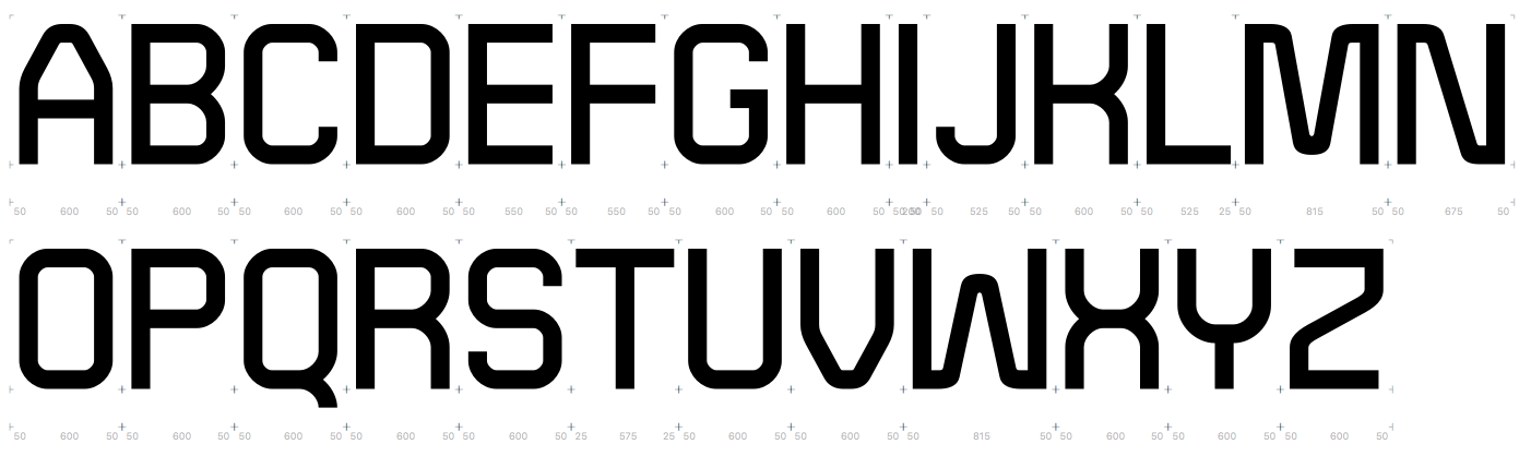
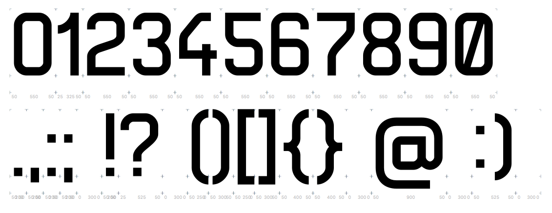
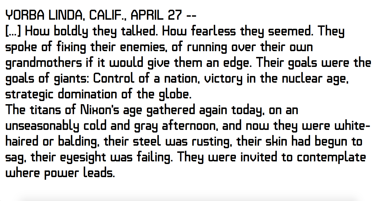
Can anyone identify what these might be? Thanks.

TypeCon 2019 Call for Programming

$
0
0
In case you missed it:

The TypeCon 2019 Call for Programming is now OPEN! 

TypeCon 2019
Minneapolis, MN USA
August 28th – September 1st, 2019

TypeCon is one of the largest and most diverse US events for typographic and lettering professionals. We are seeking dynamic individuals with a background in type, calligraphy, lettering, and similar creative arts to share their expertise with conference-goers in a friendly and accommodating environment.

We are seeking proposals for:
– 20 minute talks
– 20 minute Education Forum presentations
– half-, full-, or two-day workshop sessions

Selected speakers will receive a number of benefits including complimentary admission to the main TypeCon program.

Proposals are due March 1st, 2019.

To submit a proposal or to learn more, visit: 
typecon.com/proposals


Thanks!

2019 SOTA Catalyst Award call for Entries

$
0
0
Attention individuals age 25 or younger:

The 2019 SOTA Catalyst Award Call for Entries is open!

http://www.typesociety.org/catalyst/call/

Each year, The Society of Typographic Aficionados recognizes an individual 25 years of age or younger who shows both achievement and future promise in the field of typography. The award brings broad industry exposure to young people creating original works in the fields of typography, type design, lettering, calligraphy, and type history.

We encourage any young person active in these fields, whether a professional or a student, to nominate themselves for the SOTA Catalyst Award by submitting an entry.

The 2019 recipient will be awarded up to $2,000 USD in reimbursement for transportation and lodging expenses to attend the TypeCon2019 conference in Minneapolis, MN USA, August 28th to September 1st. They will also have their conference registration paid for and be required to give a 20-minute presentation of their work during the main conference program. 

Submission deadline: March 16th, 2019.

Please view the full requirements at  http://www.typesociety.org/catalyst/call/


Thank you!

Rosetta hiring a Font Engineer (part time) and Studio Manager (full time)

Printer recommendations for proofing?

$
0
0
What printer would you recommend for proofing purposes, today? $500 or under would be nice since I'm an independent designer. Ideally, the minimum requirements would be: - true 1200 dpi, - Adobe PostScript 3 - laser printer technology Are there other minimum requirements I should be considering? In the U.S., the low-end cost for 1200 dpi plus Adobe PostScript 3 seems to be above $1,000. To get something around the $500 mark and below usually means going with the vendor's PostScript 3 emulation. In the past, I wanted to stay away from most emulations. If I lived in Australia, I'd probably try out the Fuji Xerox DocuPrint P355d (which hits the under $500 mark with Adobe PostScript 3 and 1200 dpi). http://www.fujixerox.com.au/products/printers/monochrome-printers/docuprint-p355d/dpp355 Are there printers with PostScript 3 emulation and 1200 dpi that work well enough? 2400 dpi, though nice to have, seems to make the price increase a lot. Thanks! [Posting in Software since there wasn't a Hardware category.]

Uneven lowercase at low resolution

$
0
0
Here is the screenshot of the typeface I am working on. At 19px size and lower, lowercase start to "dance". Tops and bottoms are uneven, like they have a different baseline/x-height. I don't know what's the reason, because I can't recall such situations earlier. I defined the zones in a classic manner, and did PS autohinting (with manual hint adjustment in addition). Even tried to push extreme nodes in zones (thought it might be a coordinate rounding problem). I would appreciate much any input on this, thanks!


How Glyph Level PS Hints actually work?

$
0
0
Let's say we have a capital H with glyph level PS hints defined as on the image below. The question is how these hints communicate with the rasterizer in order to accomplish gridfitting. 

In other words, we have H scaled down to the lower resolution, which looks wrong because of rounding errors (left stem is i.e. one-pixel size and the right is two, the bar is at the wrong position). And then PS autohint approaches rasterizer and says what?

Also, in that conversation, what means the hint position (bold green line) and what hint size?

Thanks!


Self-ref - a special purpose serif font

$
0
0
Hello,

I have created a special purpose font for my project. I do this for
boredom and curiosity. I'm new to font design. By profession, I'm a
programmer. I also do lot of photography and like visual arts. I live
in the Czech Republic.

I have created few small resolution bitmap fonts in past for some
games but this is my first outline font.

Purpose: few years back, I created this mathematical curiosity:
http://jtra.cz/stuff/essays/math-self-reference/index.html Almost ever
since that I wondered if I could do something similar that would not
be bitmap based, but with nice smooth font.

About a year ago I started learning math that would be needed for
this: Bézier curves.  I have the math part prepared. I made a program
to play with curves which I eventually turned into sort of glyph/font
editor (screenshot included) in which I designed following font. I
call the font 'Self-ref' based on purpose for creating it.

The font originally started as zero-contrast slab-serif but later I
tried increasing contrast and kept it that way.

Design objectives: To emphasize that used mathematics is flexible, it
should not feel like pure geometric font. It should not be drawn with
circular pen. Serifs. Contrast should not be extreme.

The font will be used for typesetting some mathematics and few texts
around.  I know TeX/LaTeX and I'm aware of its enormous use in
mathematics papers. TeX defaults to italics font for most of the
mathematics. It is nice that it stands out in wall of regular text,
but I don't feel like all the math needs to be typeset in italics. I
also feel creating italics font would be much harder for me. So I want
to use roman type for both mathematics and texts around. It will not
be much text anyway.

I have automatic kerning algorithm which I feel sort of works most of
the time except for symbols which are often kerned too tight (for now
I correct it manually after kerning).

I have not yet tried to use this to typeset much mathematics. I will
need few more glyphs and I will probably want to improve my automatic
kerning algorithm for symbols before that.

There is only a bitmap output, no PDF, so I include two bitmaps of the
same text, one to fit forum post and other high resolution
bitmap. There is no hinting so low resolution look is not great.

What problems and inconsistencies stand out in the font? Should I try
to simplify it (are three ways I do terminals too many)? Anything you
like? :-)

Link to higher resolution image (317KB)
Link to screenshot of my glyph designer (114KB)

Pepo the Clown

Stumped by Word 2011 Mac again...

$
0
0
Just when I feel like I have a full grasp of tackling font naming for Word 2011 Mac, I'm thrown a curve ball...

I usually master typefaces with Reg, Italic, Bold, Bold Italic style linked, and then any other weights as a separate font family that only style link the upright with its italic counterpart.

Well, I have a client that is wanting files that have all the fonts show up under a single Word submenu, with no style linking.

Thinking this would be as straight forward as assigning all files the same standard macStyle and fsSelection values, I went ahead and did that, but keep finding styles missing from the menu and being style linked! I tried a zillion variations of macStyle, fsSelection, usWeightClass, panoseWeight, or any other values I could think of, and still the same results.

Eventually, I figured out that Word seemed to be reading the actual name ID, seeing the word "Book" and "Book Italic" and style linking on its own. To test, I even took an entirely different font, and added the words "Book Italic" into the appropriate name ID slots (still with no actual linking values anywhere), and bam, style linking in Word!

Is there any way around this?

I'm also having a totally different, incredibly weird and frustrating Word problem, but I thought I'd start with one issue at a time.

Any help would be greatly appreciated!
Josh

Working title "Exactica"

$
0
0
Hi all, 
I've been working on this idea I had about combining a strict grid with rules for radia; from a few specified ones, a radius is chosen based on the specific situation (end of stroke, lowercase curve, lowercase intersecting curve, uppercase curve, uppercase intersecting curve).
For example, look at m, B, or 8, and the multiple different radia occurring inside those single characters. 

The goal of such a system would be creating an impression of precise industrial machine-etched type. 


This is of course very much a work in progress and still early at that, please consider it as such. I will increase the weight difference between upper and lower case; some characters are not quite there yet; I have to think about the way MNVWXYZ fit in with the rest. 

I've had to pause the work on this for two months and now I'm resuming it, so I thought it would be a good time to hear what advice or criticism someone more knowledgeable than myself could offer. Thank you.

Here are some current samples:


And a chunk of text:


BlueValues and BlueScale in Private Dictionary

$
0
0
After I created superior and inferior numbers (not originally present) in a font to handle fractions, I receive the message:
`Alignement zone height in BlueValues/OtherBlues array is too big for BlueScale`.
So, the result is a uncorect Private Dictionary.
What exactly does it mean?
And what kind of action should I take to set the correct values?
Thank you

First full sans family - A little criticism please

$
0
0
Hello All! 
Long time listener, first-time caller (Sorry, I couldn't resist).

A little about myself, I am a designer/art director with nearly 20 years of experience. Throughout my career, I've always loved drawing letters, typically for one-off logotypes, but I've never actually tried to finish a full typeface.

My interest in drawing letterforms has taken me to various workshops (Crafting Type) and intensives (Reading) to hone my craft WITH the added benefit of focused criticism, which brings me to post where I'm currently at with my first full family.

I know that there are so many excellent sans-serif families. This process is less about making a product for the market and more about finishing a full typeface. My idea was to create a sans-serif family that is contemporary, economical (in space) and readable.

I'm still working on some general spacing issues and some additional drawing tweaks through the spacing process.

I'd love any criticism(s) that you have to offer. An A4 PDF is attached.

Many Thanks in Advance!


The return over investment (ROI) of custom fonts

$
0
0
Yesterday I've had a conversation with the CFO of a major design agency in Brazil and he brought some thoughtful questions on why is it good business for many companies to have a custom typeface designed.

I have read many and thought of some myself and would love to hear from those with more extensive experience in selling this service.

Usually all arguments fall into brand value and/or money. But how to measure both?

Is the return over investment of a custom typeface measurable? Here's my thoughts:

If we compare the company's spending in perpetual (desktop/server) and renewable licenses (webfonts, hosting services, etc.) today and in the future (say a 10 year period), we'll probably have a high number that may be higher than the investment required for creating a custom font. Considering that most savvy companies wouldn't get a 400 people, multi-platform license out of a foundries website, that number may be far too exaggerated, so one should ponder that number a bit.

Can the type-as-brand-asset argument be measured in numbers?

Just like a logotype may have a certain money value attached to it (Coke, Nike, etc.), can typefaces have the same?

There's some PR attached to the design of a new font, some of it are bad PR, other wonderful. Is it something that could be accounted for in the ROI? I think this may well be disregarded because such an event only gets known/cared for by a niche audience.

Are there other aspects in the work that could be transformed (asset management, ease-of-use, peace of mind) into a cold hard number?

Thanks, and look forward to your answers!

Space character in Arabic and Latin fonts

$
0
0
We have a problem we struggled with for many years without success and face now one more time, I am hoping that someone on the list may have a solution.
For fonts that have both Arabic and Latin scripts we need the space character to be narrower in Arabic, especially in bolder styles. When we use an existing Latin as a companion, the space character becomes wider than required for Arabic. In the past, we added a narrower “space.arab" glyph and a substitution lookup to replace the Latin space with the Arabic space. This substitution works in Word but not in InDesign. We have tried placing the substitution lookup in <calt>, <rclt>, <ccmp>, as well as combinations of these features; ALL of these substitute correctly in Word, and NONE of them work in InDesign. 
We tried a slightly different approach now by making the narrow space as the default and changing that to the wider space in Latin script via a substitution lookup in the <ccmp> feature. We think this is a better approach since Arabic is the primary script in these fonts. This did not work and the narrow space is applied in both scripts in Word and in InDesign. 
Does anyone have information to shed light on this issue and solve our problem? Did anyone succeed in applying two different space characters to two scripts in the same font?
Thanks in advance.

Setting fractions

$
0
0
In setting the fractions, I note that generally the fonts have an absolute symmetry in the general dimensions, even at the cost of setting up different kernings. In the image that I attach (this is the Adobe Jenson Pro) it is noted that, for example, the 3.numr and 7.numr have a significantly different distance from the slash.


Now: is it better to aim for a homogeneous kerning or to guarantee the same amplitude for each fraction? And in the latter case, is there a specific technique to gain rigorous results, or simply a shrewd appeal to kerning?

FontLab VI now shipping

$
0
0
FontLab VI is here! Unleash your type design creativity with FontLab VI, our ultra bold font editor. Design and edit glyphs more easily than ever, draw multi-color fonts, or make variable fonts. Type drawing, spacing, kerning, hinting, OpenType features and Python scripting — FontLab VI does it all, on both Mac and Windows.

Get your free 30-day trial or buy FontLab VI at https://fontlab.com/VI

FontLab VI is $689 (it includes both Mac and Windows versions). 

If you bought FontLab Studio 5 between Nov 30, 2015 and Dec 6, 2017, the upgrade to VI is free, all other users of FontLab Studio 5 can upgrade for only $199, and Fontographer 4.7 & 5 users for $344.

image

Line gap on web/desktop fonts (Adobe Fonts/Typekit)

$
0
0
Before, when Typekit was just webfonts, they used to set the font line gap to zero.
Nowadays, the fonts are used for desktop as well – does this mean that this practice has stopped?

Regis, a new serif font

$
0
0
Hello everybody.
First, a little about me: I’m an undergraduate student at McGill University. I have been interested in type design for quite a while, but this is my first serious endeavor towards actually creating anything which would seriously be worth using, which I’m calling Regis (in reference to Romain du roi).
I was reading some books printed by the Cambridge University Press set in Monotype 178 “Barbou,” which drove me to search for a digital font which was reminiscent of this face. I found a few which similarly follow, like Barbou, in the footsteps of Pierre-Simon Fournier, but none which replicated the warm, soft impression I felt when reading these books (I would post a scan, but unfortunately the text is under copyright and I don’t wish to run afoul of any authorities). Furthermore, being an avid user of free and open-source software, I wanted to design a font which would be able to be used by anybody under a free license. (In terms of Fournier-inspired free fonts, Bitstream Charter and Adobe Source Serif Pro both exist, but their designs go in a very different direction from my intentions and I preferred beginning from scratch to making modifications.)
I’ll note that Stephen Coles’ specimen of this face has a number of details which are not present in my face (such as the gap in the lowercase w). As the linked sample and the books I have are both set at 10 point, I find it likely that these variations are the product of the printing process. My desire is to replicate the feel of these books to some extent, not whatever Monotype happened to have been doing. In any case, I've also taken some liberties with my design.
So far, after a few weeks, I have a lowercase alphabet (minus a z), an uppercase M and a period/full stop. The kerning I have yet to seriously work on, so forgive me if it is off-kilter. This is my first design, so please let me know what you think, though please keep in mind that this is an extremely early draft. A few of the letters are wonkier than others at the moment. The line spacing is also a bit too cramped in this sample.
Thanks are due to Luc Devroye, who happens to be here at McGill, with whom I’ve discussed this design over the past few weeks and who has provided some input.


The source (FontForge format) is available on my GitHub.
Thank you!
Viewing all 4153 articles
Browse latest View live